A large original painting featuring purple, pink and burgundy paints
I like purple. I’m a big fan.
I like lilac and maroon and black too.
So when they all get put together how happy does that make me? Very!


")
I like purple. I’m a big fan.
I like lilac and maroon and black too.
So when they all get put together how happy does that make me? Very!
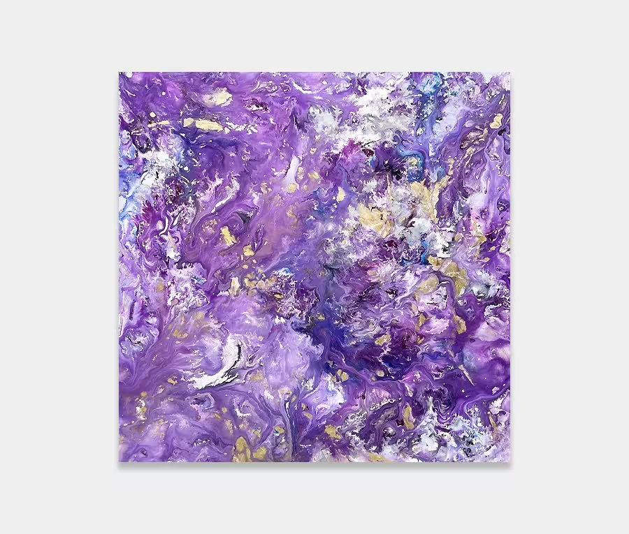
What can I say about colours like these? When I get to put them into a large painting I am probably at my happiest. I’ve written before about my love and a fascination with the colour purple so I won’t keep banging on about it (in fact I have written a very personal account of why I like to paint with it so much in a recent artwork called Infinite Possibilities). So let’s just say that in my own opinion, this one’s a bit special.
So why is that I hear you ask? Well that’s not really an easy thing to write about if I’m honest. You’ll have to take my word for it. If it helps I can say that it was the very last painting I did before Christmas 2015 and the last one before I got sick. It had been planned for a few months but had never got put onto the schedule in the studio. When all the involvement of the festive season had been dealt with and the pressures and strains of the previous few months finally discarded I headed for the paint studio for a precious few ‘me’ days before I stopped (which was actually late on Christmas Eve – mainly putting the finishing touches to this).
Base coat, then drying. Secondary layers, then drying. Next day more swirls and rivers (where it partially gets its name from), then drying again. Throughout Christmas Eve I repeated this ‘apply and dry’ method until I had something pretty tasty. Of note is the blotting effect that reaches across the centre and forms loops that fade off with a flick. These were created using a dark burgundy paint (almost black) and were chemically manipulated on the canvas. Additives can be a lot of fun as long as you know what they do. These spots were created using a dispersal compound. Lots of slow and careful drops with a pipette and plenty of breath-holding!
These dark swirls lie in contrast to the wide ranging variations of purple and lilac – the two base colours that I used. From these I make almost every other shade by adding white and cream and hints of metallic silver too. Mixing is another great leveler – it’s the point at which you have to stop. I like mixing as I go because I can use that time to assess and correct if necessary. Breaks are a good thing, especially when I’m working in a similar palette of colour. Nothing like a sit down and a think whilst your stirring away with half a dozen pots of paint.
I think that, although this is a fairly large painting, you really have to have it reasonably close to you to be able to get the benefits from it. If it sits too far away it kind of gets lost a little bit. So if you have a huge open space and a wall at one end I really don’t think this is going to look as good as it could. The honesty inside me says you need to hang it in a more intimate space where it can envelop itself around you and where distance is not an issue. After all, with colours like these why would you want to be sat on the other side of the room?
And so to the name. If I haven’t already mentioned her elsewhere on the site then may I recommend you go check out Emily Barker. A brillaint singer/songwriter with the voice of an angel. This is the title of her album of the same name (Dear River). If she ever reads this I hope she approves! Her music is required listening in the gallery and chances are it will be playing if you ever decide to visit.

 Magnetic Fields