Zero Gravity
£3000
150cm x 110cm (59″ x 43″)
includes UK delivery and hanging
(Worldwide shipping available)
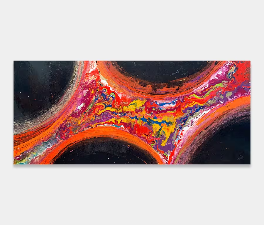
Zero Gravity is a medium sized, modern art painting created with a primary palette of purple, magenta, white and copper colours. It features accents of turquoise, black, orange and red. Being a painting that’s a good size but not too large, it will pretty much fit into most wall spaces in most environments.
There are many things I love about this painting so let’s take a look at the main ones.
The first is the colour distribution. Notice how the outer edges are dark – this is a technique to help ‘frame’ the painting without an actual frame. The effect of this is to make the centre feel closer to you than it is and also give a sense of depth. In many ways it almost feels like you’re about to step through some porthole or window (well, it does to me anyway!).
Colors never feel unbalanced or heavy even with offset applications of turquoise and orange. The trick here is to counteract one with another so that different colours can oppose each other without feeling out of place.
Details and finish
The next thing I love about this modern art painting are the shapes. I used a squeegee to drag paint into lines and then moved them across each other at well chosen intersections.
Where the paint oozes outside of the confines of the blade you get thick residues of paint that form a kind of plateau that serves as a boundary marker to what lies next to it. A glance at the close up photos will show you what I mean.
The result is a surprisingly textured painting that absorbs and refracts light in all kids of interesting ways. The details are stunning and the depth of them is bewildering; you have to get in very close to appreciate how fine the tonal ranges and blends are. This is definitely a painting that gives from every viewing angle and distance.