A complex purple and pink painting with blue accents
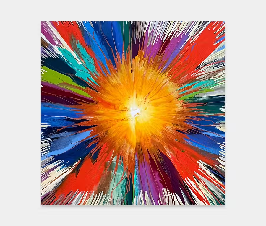
There’s nothing subtle about this artwork.That’s a good thing.
Because it’s good to celebrate the strong and powerful as well as the quiet and restrained.
Colours to die for and a composition that wrestles you to the ground every time you look at it. Perfect.


THE STORY BEHIND IT
There are some colours that follow us throughout our entire lives. Colours that define and shape us. Colours we love, enjoy and revere. As an artist I have many of them but the one that stands above the rest, for me, is purple.
I choose to ignore the standard model of definition that has helped define its interaction with the human species, instead preferring to let my own brain understand why I like it so much. It’s this elemental thing that makes me want to use it so much. Having said that I have to be careful I don’t overdo it and, in fairness, I do have a love of colour in general but I find purple to not only be the most flexible and enjoyable to use but the colour that returns the most deep and involved emotive responses.
Over the years I have coerced it into all kinds of shapes and finishes but this new painting is definitely taking my methods into a new direction. Whilst the techniques in this artwork are to be found in other paintings I think it’s the way in which I’ve used them that has made this one stand out more than usual. Granted it won’t be for everyone but that’s OK; we can’t all like everything we see can we?
So what can I say about this? Well, it’s certainly an involved piece. No matter where you look there’s a story to tell. It’s not quiet or restrained so it is going to look fantastic in a space that is. It’s an attention seeker and it’s very dominant. In an effort to temper this riotous behaviour I have added pink and silver to tone down all that mayhem and waywardness. It has touches of gold too that add some much needed warmth.
It’s a painting that will need space to breathe too. A wide open wall and a source of natural light will bring out the joy and extravagance that this artwork has to offer. It won’t be happy sat in a poorly lit stairwell for example. It’s also very happy to hang in either landscape or portrait orientation and works remarkably well in both. I also like the way that it flows too. What I mean by this is the manner in which I have taken the applications from one side to the other, with careful attention placed on changing their behaviours as they move. What appears light and carefree at one side finishes with a dramatic series of dark flowing forms at the other.
Central to the existence of the whole painting are those single purple and black arcs that run through each other in the centre. They dominate from one side then fade out on the other. Nice. And despite the darkness and depth of the black and blue colours I still think that the painting is, on balance, a very light and airy one. Sure it’s a frivolous abandonment of care and a wanton disregard for rules and conformity but it’s also extremely buoyant. It really can reflect any kind of mood and emotion you want it too.
And that, dear friend, is the reason why I love purple so much. It has the ability to transform our thoughts into any direction we want without the burden of what we are expected to feel. It is your story each time you experience it. Personal, owned and utterly without limitation. Perfect.
")

")