")
A medium sized lime green artwork with black accents
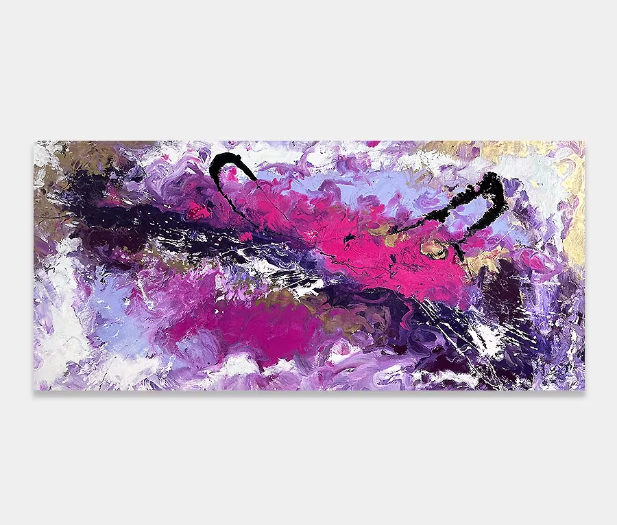
It’s probably the colour that makes me think of fresh limes when I look at this.
But it could also be the way that those gentle arcs ebb and flow.
Whatever it may say it’s certainly bright and deceptively cheerful.
")
")
")
")
A slice of lime anyone?
I should use more lime green in my work. I like it but it doesn’t ever seem to feature that prominently in my paintings. So it is with a sense of relief and pleasure that The Grass Is Always Greener has become a reality. Mainly because of the delight I had in creating it.
I’m not going to hide behind some preconceived notion that this was a pig to paint or that it took me weeks. It wasn’t and it didn’t. Much of that is down to the planning and preparation I did beforehand. I mixed the colours correctly, assembled the tools, chose the right weave of canvas, cut the spreading tools to the exact width I wanted; that kind of thing. Being prepared is a must for me otherwise it all goes haywire.
Practicing in my mind
During this phase I go through the physical movements of painting in my head. I repeat them over and over again until it becomes instinctive. That’s key for this kind of painting as it doesn’t have the luxury of being able to rely on lots of applications to carry it off. Instead there are only two – and each one has to be perfect otherwise I have to start all over again. Enamel paint is unforgiving and it bites at every opportunity.
So the main arcs in this piece are a single stroke of the applicator to get the shape and then they are maneuvered into what you see using an array of other tools and chemicals.
Getting on with it
Execution was swift but considered. And there was plenty of time between each application. You only have to make one wrong move or apply some paint that isn’t in the right place and the whole thing becomes awkward and heavy. And that means it goes in the bin. Seriously. You wouldn’t believe how many get thrown away because of a single wrong move.
Fortunately though, both the main arcs are perfectly balanced and also bounce off each other thanks to the tonal variation of the paint. The addition of inner and outer arcs (of black and silver respectively) adds definition to them without making them dark and oppressive. Paintings like this, for me, are all about light and dark. I guess that’s why I called it The Grass Is Always Greener, a phrase I have always associated with the concept of light and dark.
It’s all in the details
So then we have the accents and additions. These cleverly positioned blends of metallic silver and steel grey lend some weight to the painting yet never crowd it. I like that there’s the merest hint of structure but nothing that overwhelms or dictates. I love the feeling of opposites too; using circles and squares as the principle to have a little fun with.
And we all know what they say about opposites right? The accented line structures also have the ability to change your focal points too – indeed that’s the reason I included thew two green dots. Just enough to be balanced but just enough to be playful.
I think this could work particularly well in a large kitchen with white and grey in the colour scheme. Also anywhere where the outside is visible too. It will have the effect of linking inside to outside with great style and ease.
")
")