")
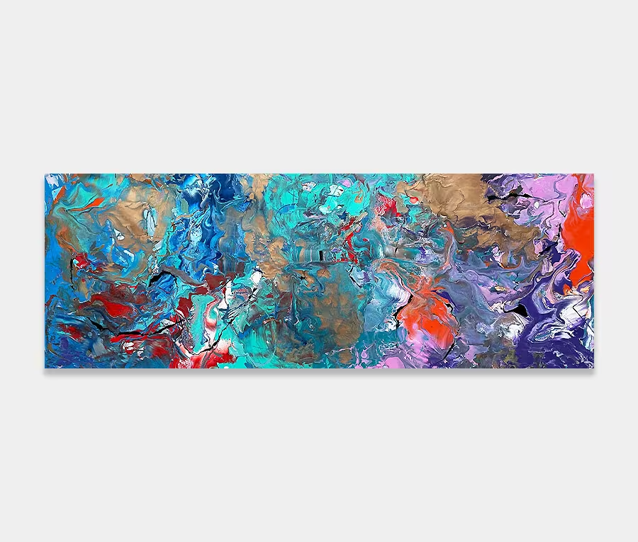
A long, blue and pink painting with dark undertones
Based on memories and sketches from a trip to New York.
This painting is a mixture of the sounds, colours and landscape from a view out over Manhattan harbour and out to Staten Island.
Featuring rich tones, bright light and the depth of natural elements.
")
")
I’ve long since relied on a sketchbook to record the things that trigger responses in my head. It’s a good practice and one that has helped me paint Liberty Belle nearly two years after first experiencing New York and Manhattan – the subject matter it was based upon.
The memories are still incredibly strong. The colours I saw in the water, the changing light as the sun moved overhead, the vibrancy of the people who passed me by and the wealth of materials that formed the backdrop of the harbour and skyline. Wood, metal, vegetation, rock, water; all carrying their own unique signatures.
Of course, as an abstract artist I never attempt to recreate actual things in my paintings – and by that I mean constructing a piece of art that has distinctive and deliberate figurative forms – instead I like to offer the merest suggestion that something may exist and let your own mind work out if you see that or not. And that is entirely deliberate for a very good reason.
It allows you to either see a view out over the bay or it doesn’t. That’s the great thing about abstraction – you really can allow yourself to see what you like in it. Just because this one happens to be referenced by a trip to New York doesn’t mean it can’t remind you of something else.
I think that should be recognised as something that a strong, well-thought out abstract painting can do well. It should be able to transport you to the places in your mind that mean something because that’s how we are best able to relate to it. And once that happens the connection is formed.
And so to the painting. It’s a real mixture of styles. In some parts it carries definite structure by way of lines – especially the large single blue one, the small white one and the central pink and black one. These three structures give the painting its shape and is the cornerstone from where the rest of it was put together.
Added to this was a series of less defined and more organic shapes at the darker, more murky end of things (there’s a harbour reference in there again); relying on the inclusion of dark green for a little colour balance. The contrast to which sees hints of yellow and purple make a dramatic entrance on the opposite side.
All these applications get punctuated with other areas of colours that oppose the direction they move in. Essentially I’m playing with angles and changes in direction in much of the painting. I think of this as representing the frantic nature of human movement – something indicative to New York in almost every respect.
So I guess if you choose to see your own story within the painting that’s brilliant. I’ll consider my task accomplished. But whatever the reaction or story it brings with it it will always be one of the more individual creations of mine and one I am enormously pleased with.
")
")
")