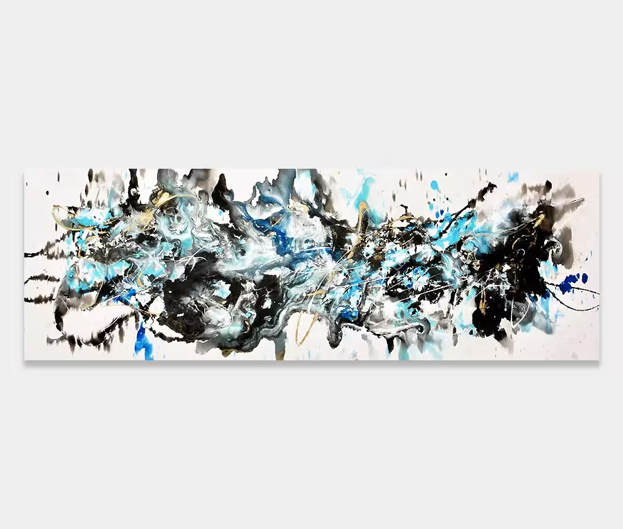
A mid sized abstract with black, white and gold paints on canvas
White, black and gold – what more can I say? Possibly the greatest combination of colours in my own opinion.
130cm x 140cm (51″ x 55″)
White, black and gold – what more can I say? Possibly the greatest combination of colours in my own opinion.
130cm x 140cm (51″ x 55″)


An absolute winning combination of colours. It’s a trio of perfectly matched tones that let me create at my best. I think it’s the contrasts that you can achieve with them that really singles this combination out as being one of the very best and most flexible.
So here we have a big old rip in space piercing through the centre of the painting. It’s complimented by a series of forms that, on one side, dissolve and diffuse the strength of the black and, on the other side, add a little warmth and intrigue thanks to the use of metallic gold.
As with all my original paintings I only ever sign them on the back so this gives you complete freedom to choose an orientation that suits. I have shown it in two of the four possible ways to hang it but really it comes down to what feels comfortable.
I deliberately do this because it changes the dynamics of the painting each time you rotate it. It also helps to rejuvenate the space it hangs in by periodically turning it. It’s a simple trick but one that’s surprisingly effective.

It was painted flat on the floor as most of my paintings are done and it was completed in a single session. This means that base coats and subsequent layers were all put together without me leaving my paint pod (something I normally do to allow paint to cure). You can see more about the paint pod (from around the 18 minute mark) in this 2019 updated tour of my gallery and studio.
Four colours have been used and a number of unusual tools. Of particular interest to me are the lines of white and black paint that have been stretched to form wavy lines – these sit next to the big black mass in the centre. I just really like that bit above all the rest!
It’s always really difficult to show the textures on my paintings. The problem is one of lighting and where you position yourself relative to the canvas surface. Nothing is ever just one dimensional and using enamel paints, in the way that I do, helps me create some mesmerizing reflective and non-reflective finishes in to the completed paintings.
Undulations, matt and gloss contrasts and the volume of paint used all come together to form a visceral and highly touchable experience that can only really be enjoyed when you stand right next to it.
In this painting it’s abundant everywhere – adding yet another cool dimension to an already rather delicious painting.

 Signs of Life