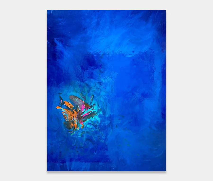
A large blue and gold painting with silver and black highlights
I really enjoy using blue and gold as a combination; in this original art work I have also included silver and black to create a very deep and uplifting painting full of beautiful details. 200cm x 130cm (78″ x 51″)
SOLD
Using blue and gold
When I’m cutting canvas ready for painting I am always acutely aware that things can go wrong. It doesn’t mater how careful I am in my preparation or how meticulous I am in choosing paints and application tools, it can all go wrong in a heartbeat.
However, it can also go spectacularly right. So right in fact that you can feel it becoming something a bit tasty as each drop of paint is spread around and formed. With Climb a Little Higher that’s exactly what happened.
Forming the ideas behind it
My concept was a simple and straightforward one: black blended into blue then bands of silver, gold and white applied at an angle. I wanted the black and blue to form the main part of the painting with everything else playing a supporting role around it.
My idea was to contain that bubbling undercurrent of rich dark colours by introducing a band of silver with a defined edge, almost like a shoreline or the edge of a clifftop. It needed something final to be able to make a clear separation between the two. More blending would have destroyed the boundaries that are so critically needed in the centre of the painting.
Why this painting works so well
There are many subtle details that reveal themselves in this painting as you spend a little time with it. However, as an abstract, it can often be tricky to define focal points or the bits that allow you to form an opinion or a connection.
In this painting the success comes down to just a few turns of a brush and that gorgeous light blue that’s doing its best to escape from the darkness.
It’s a rather beautiful Pantone colour that I had mixed and it cleverly does two very important things: firstly it breaks up the harshness of both the black and silver and, secondly, it carries the only real defined shape in the entire painting (by that I mean the loop and pointed part). I included these right in the centre so that your eye has a defined point from which to build a reaction for your brain. Without these two subtle movements the painting just wouldn’t work.
This is how fine the line between success and failure can be sometimes and most artists will relate to this.
The devil is in the detail
The beauty of this abstract doesn’t end with the big stuff though. There are plenty of finer details to behold. Furthermore it’s proof that despite it’s calm and composed form there’s actually a lot of thought that’s gone in to making something simple feel a lot more involved and considered.
There are thin veins of blue that run through the silver and within that there are even some textural silver lines and shapes that have been formed with a marginally thicker version of itself.
There are actually four different colour blues in the painting and two shades of black – you need some natural light to fully appreciate the subtle nuances but I assure you they are there.
I have also blended cream and blue in to the white portion too rather than just opt for a single mass. I think of that bit as being like a stormy day (or something like that). I also featured white in the silver part too and these almost look like fracture lines; it helps break up the finality of the colour.
Conclusion
Climb a Little Higher is a beautifully painted large blue and gold abstract painting that is packed full of light and shade. It’s metallic colours react with all kinds of light sources and the depth of blue is so great you could almost dive in to it!
It’s perfect for a large feature wall or open space and doesn’t need a PhD to get the most out of it. It’s light and airy as well as being very uplifting.
Free home viewing
You pick the art, we bring the gallery.
That’s right, you can stay at home, sit on the sofa and let the art come to you.
Pick as many as you want to see and only pay if you decide to buy.