A large red and turquoise art work with silver and purple accents
I’ve discovered a new combination of colours that make me very happy. Purple, red and turquoise are my three new best friends!
200cm x 130cm (78″ x 51″)
I’ve discovered a new combination of colours that make me very happy. Purple, red and turquoise are my three new best friends!
200cm x 130cm (78″ x 51″)


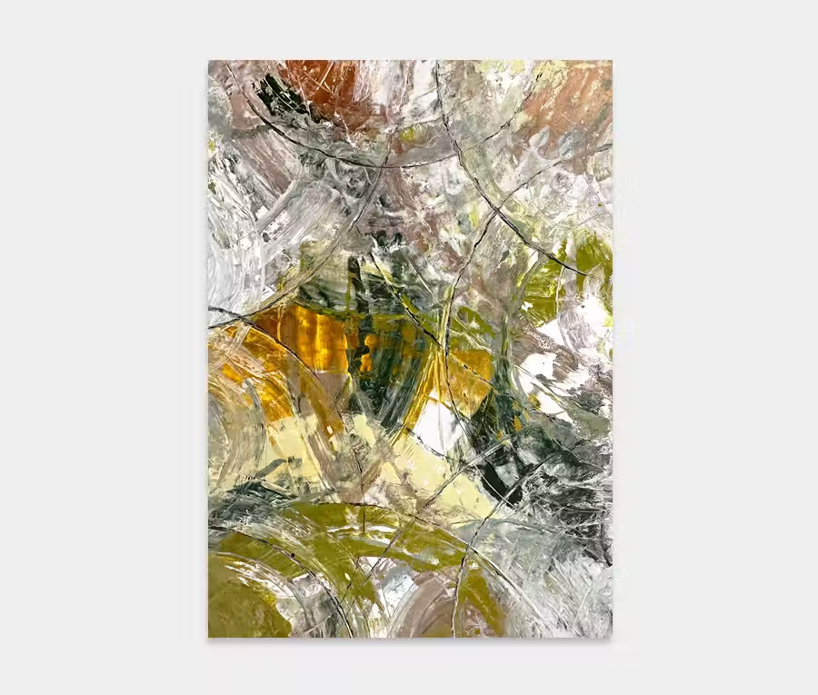
So here we have a mainly red and turquoise art work that’s all about my memories of a trip to Brooklyn.
What’s probably most interesting to me is the enormous variation in colours I saw. If you’ve been there you’ll know that there’s an awful lot of concrete and stone around. The bridge, the museums, the roads – an overwhelming plethora of urbane infrastructure.

However, if you look more closely what you actually end up seeing is a rich tapestry of colour and texture that’s not just bound to the physical properties of the area. Of particular interest was the view out of the bay area back to the Brooklyn Bridge.
I can recall the changing light conditions as I walked over it, sometimes looking back behind me as well as in front. It was a bitterly cold day when I walked across; I remember ice being piled up on handrails and on overhead suspension wires. And oh how the sky was so blue and clear.
The waters looked incredibly deep and formed from a rich purple hue – not at all what I had expected. As the midday sun beamed down the reflections of the buildings bounced light all around. I remember too the tones of the bricks that the buildings were made from. Old municipal constructions sitting aside contemporary glass structures really helped to highlight the depth and range of colours.
And so to the extraordinary mix of people. All sizes and shapes, all colours and religions. I loved the mix of extremes here; people going about their business in this one place. It was this kind of influence that made me want to translate my observations into a series opposing lines and shapes.

I chose a series of repeating movements as this was to be symbolic of the bridge itself – the part that traverses two places and brings them together, almost to the point of it becoming seamless. For most people it’s not even a link at all – it’s just a way of life. The red colours conjour memories of the setting sun as blue skies and water mingled in with trees and shrubs. 
As an abstract you may not be able to pick out any specific visual references and that’s just fine. it’s overall impact is created to promote a feeling of being in this vibrant district of New York, rather than represent anything tangible you can see.
And if flip it 180° you change your perspective completely.
For a part of New York that’s bustling with all kinds of wonderful things it seems only fitting to honour that in a very intense and uplifting painting. It’s ridiculously easy to live with, is full of life and energy and thanks to it’s very generous size will fill almost any kind of space with great ease.
And you don’t need a PHD to understand it either.
Fabulous.

 Climb a Little Higher