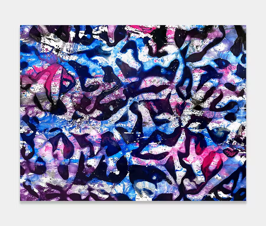
Liquid Shadows
SOLD
200cm x 130cm (78″ x 51″)
includes UK delivery and hanging
(Worldwide shipping available)
There’s an inherent danger in overdoing an abstract artwork. Too much and it becomes unbalanced and difficult to look at; too little effort and the painting shrinks back in to its own shell.
So, in my world, I am always looking for that sweet spot where you get just enough of what you want but not too much of what you don’t. The two forces have to be in balance with one another.
So that’s why I have firstly opted for a couple of very subtle focal points. These are the dab of bright pink and the splodge of Royal purple. They are the bits you’ll probably see first, then not notice, then come back to as your eye finishes the initial scan.
These help break up the obvious ‘banding’ of the painting and give the darker areas a little more verve. It’s just enough but not too much. If the pink bit was any larger you’d probably not notice how awesome the metallic silver and gold was.
Adding textures
For a painting that has a basic composition (it is, after all, just a series of coloured bands) it’s important to build in as many extra elements as you can. One-dimensional canvases bore me rigid so I actively seek to do things with the paints that add movement and height.
In Liquid Shadows there are hundreds of tiny textures and movements popping out in every banded colour block. The purple areas have some very complex layering whilst the gold and silver metallics enjoy some wonderfully chaotic splashes and pours – most of which you can only see if you’re standing in front of it.
Choosing the environment
You don’t have to be a lover of purple, or have it featured in your living space, for you to enjoy Liquid Shadows.
Any neutral scheme will love this purple painting and especially those with some natural textures like stone or wood. The warmth of the gold gives it a grounded and homely feel whilst the playfulness of the other colours give you just enough pizazz without it wrestling you to the floor every time you walk past it.
A quiet corner or low-light stairwell/snug can also benefit from this painting. That’s in part down to the clever use of white and silver – two brillaint tones for reflecting light back.
And if you should have a feature wall in your bedroom that looks like it needs filling then know that purple is one of the most calming and restful colours that we humans respond too. I could quite happily wake up to this purple painting every morning!