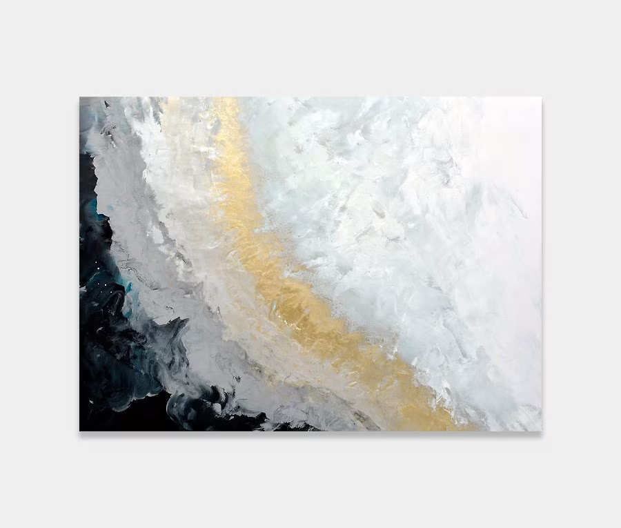
A silver and gold art work with big loops of black and white
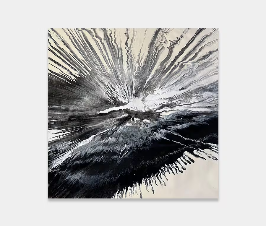
What this lacks in colour it makes up for in sheer bloody-mindedness.
What this lacks in colour it makes up for in sheer bloody-mindedness.


Silver and gold art works can be a bit tricky to get right. These two standalone colours can often feel hard and cold.
Of course, everything is contextual and whilst these colours are natively rich and desirable they can often, if left isolated, be distant and unapproachable.
Therefore it’s essential that these two magnificent colours are paired with contrasting tones that bring out the best in them. With Bolero I have gone for a monochromatic palette for the supporting role. Critical to this is the colour black and that’s why it forms the backbone of the painting.
So many of my original paintings feature elements that work from a distance and also up close. Bolero is no exception to that rule. It works perfectly in almost any space (thanks to its big loops) and yet becomes an almost endless voyage of discovery as you get drawn towards it.
In particular is the concentration of elements in the centre of the painting. The whole thought process behind the construction was to send out those giant black arcs then bring your eye back in again to all the drama in the very heart of the canvas.
I see it as a repeating pattern – a quick dart of the eyes out to the black radius on each side then a swift snap back to the collisions in the middle.
Repeat that a few time and Bingo! There’s your painting.
The detailing in the centre of the canvas is formed using a layering technique that’s comprised of a number of well-chosen applications of paint and a lot of time in between each one. Layering is a simple business – on goes the paint and then you wait.
The crucial thing here is the wait time. This is necessary to allow the paint to cure sufficiently for me to place something over the top without it mixing with what lies underneath.
Sometimes I will alter the wait time depending on the effect I’m looking for. Defined lines need more time between applications whilst mixed ones don’t. Judging the right time to apply (or not) can get quite stressful – especially if you don’t get it right!
Personally speaking I think this is best suited to a stairwell and I’ve given an example of this in one of the photos. The black gestures of paint are very grand and accentuate height whilst the gold and silver brings warmth and a feeling of being centred.
And though a stairwell is passing space (meaning there’s seldom time to stop and dwell) there’s something intoxicating about the way this particular painting promotes the feeling of movement. Perhaps this is why it feels so right for a stairwell – it’s as if it’s propelling you up and down the stairs.
There’s absolutely no effort involved. Nothing fights you, nothing stops you. Yet all the time you know exactly what you’ve got hanging on your wall. I love it when these things all work out. You’ll always be reminded of this contemporary artwork but it’ll never wrestle you to the floor.
Equally, however, its shape and forms will add a dramatic backdrop to a bright dining room or to cosy living space where there’s a nice comfortable sofa just begging to be sat in.

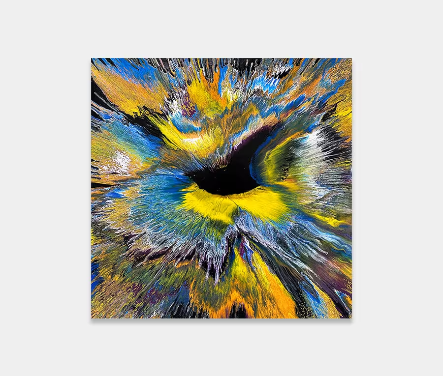
 Beautiful Imperfection