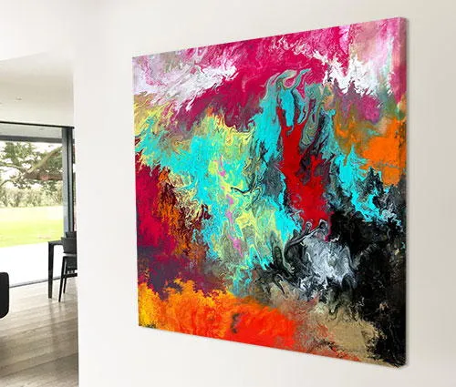
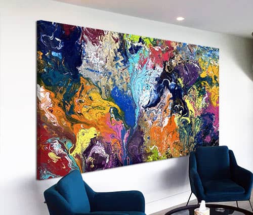
Ah yes, black, pink and orange – not necessarily a combination of colours you’d instantly gravitate towards if you wrote them down on paper. The reality is, however, all the more appealing when you get them down onto canvas instead.
When it all goes well
There are many highs and lows to being an artist – probably way too many to talk about here. But one of the great joys of creating something from nothing is the satisfaction of knowing when you get it right. And I don’t just mean any old kind of right – I’m talking about the feeling of unbridled euphoria when you see something heading for greatness.
Now I don’t want to influence your reaction to this painting as you’ll have your own opinions on whether you like it or not, and that’s exactly how it should be. No, instead I simply want to tell you how it makes me feel and why I am overjoyed with it now it’s been finished and stretched round the frame.
I think it’s fair to say that I like this an awful lot.
And that’s not just constrained to one dynamic like the colours – it encompasses the way it is composed too. Take the black stripe for example. If you shield this from view with the palm of your hand the remainder of the painting looks like a wishy-washy afterthought of pleasantness. I don’t suppose that’s a problem on the face of it but I really don’t like playing the easy game – I much prefer my art to have some gravitas.
That’s what the black does. It adds a defining statement, a break point amidst the delicate blends and shading and a grounded full stop. It’s hard to imagine the painting without it. And I think it would struggle if it wasn’t there.
Painting the stripes
Then there’s the way in which I have painted the lines. Let me dispel the myth that may have gone through your mind already – that lines are easy to paint. In my experience they are anything but. In fact, as proof that I prefer to not let gravity do the work for me, the lines are not straight if you really get up close, a tell-tale sign of them being hand applied rather than led by mother nature.
Each one is applied flat onto the surface, by hand, from top to bottom. This process is repeated time after time to build up the sequence of stripes. It’s the only way my paints will blend properly. This is one reason I am able to get them to move both up and down at the same time – by working from both sides of the canvas in the same session. It’s not rocket science – just carefully thought out and beautifully executed.
I think of the black lines as a cathedral or large building so to me it feels a little bit like a futuristic landscape. I can imagine being in some fantasy world somewhere as I set out on a mythical quest (okay, so I like Lord Of The Rings!); it’s the reason I chose the title Let The Journey Begin as it feels like that’s exactly what I would be doing if I were part of the painting.
It’s all about the colours
I think if you have any kind of suggestion of black, pink or orange then this is instantly going to feel at home. I think it’s also surprisingly neutral too – by that I mean it has the ability to brighten up a neutral space very easily without it affecting the whole room. It adds warmth in bucket loads but doesn’t overpower. It will blend in but stand out if that makes sense?
Like having all the pizazz of an original piece of modern art without the angst that some of it can create. I also think this is perfect if you have doubts over what colours you want to live with. It has so many easy going tones that you could pick almost any one of them out to have some fun with.


")
")
")
")