Reinventing the wheel
Innovation is important for creative people. The ability to modify an idea, change your approach or conceive something altogether new is a fundamental on which creativity is built. If we didn’t have that we would never make new things. Technology probably moves quicker than anything else but I’m sure the mind of an artist is never too far behind.
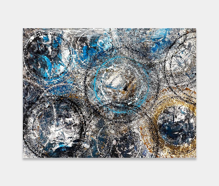
For this new silver and blue painting I’ve used a brand new technique. And whilst the colours are a collection of trusty old friends the way I have combined them is also new. The third new dynamic is the hand-made exterior frame (included) which wraps the whole thing up beautifully. It is, without doubt, one of the most gorgeous paintings I have created for a long time. You don’t have to like it to acknowledge that though – it’s flawlessly executed and deep, rich and vibrant; qualities that really can make a difference to an abstract.
Let it flow, let it flow… backwards!
I’m not really sure I can classify this into a kind of genre. Is it a ‘flow’ painting perhaps? Maybe a ‘fluid’ one? I see all kinds of descriptions flying around the internet but I think I’ll steer clear of them this time around. What I can say though is that there are 7 colours used here and applying them was something of a challenge as I pretty much painted it from the outside in and in reverse.
Confused? Sorry about that. Look, it’s a bit boring to talk about so let’s just say that knowing what I wanted it to look like [at the end] meant I had to deconstruct the painting process completely. The reason for that is because the paints and application method (in this case needles and syringes) require a little bit of organic chemistry to produce the ebbs and flows. Understanding what happens to the paints after they are applied is critical as it allows me to figure out how I need to apply them in the first place. So it is a revere engineering process in rudimentary terms.
Still with me? Excellent.
Tamed, framed and contained
The silver is epic, the blues are magnificent and the purple and aqua bring the whole painting together. However, it’s the addition of the hand-made silver and black frame that gives this abstract that perfect finishing touch. It’s weird but it delvers a very intensifying experience when you’re stood in front of it – which was a pleasant surprise. I wasn’t expecting it to do that but it has. And that’s coming from someone who rarely frames any of his work.
As you can see from some of the photos it’s perfectly happy to be hung in landscape or portrait orientation. This makes it far more capable of fitting into some unusual spaces should the room allow. It’s also not that large either so it’s pretty much going to fit into most living or work spaces. It has a collection of matt, sheen and gloss finishes too and will reflect light in all kinds of ways as you approach it from different angles. If I were keeping it I would definitely get it lit by a single spotlight – the silver is crying out for attention and the metallic blue lights up the room when it gets a direct light source on it. Bliss
You may also like to know that the sun was blazing directly on it when I took these photos and there is absolutely no colour correction done or any other light balance adjustment – this is actually what it looks like when the sun hits it.
I know – how amazing is that?


")
")
")