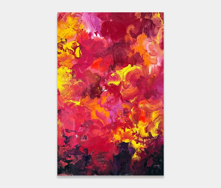
A bold piece of modern art featuring orange and black as its main colours
The combination of these shades colours, with a delicate champagne gold background, show off the painting’s tonal ranges and details brilliantly.
200cm x 140cm (79″ x 55″)
The combination of these shades colours, with a delicate champagne gold background, show off the painting’s tonal ranges and details brilliantly.
200cm x 140cm (79″ x 55″)


After a period of concentrating on creating smaller paintings and artworks in the paint studio I’m returning back to the larger format canvases with this unapologetic leap into form and colour. 
I’ve been trialing some new application methods recently and have got to a point where I can begin using them on paintings I’m happy to put my name to. I also recently used the same set of methods on a painting called Swept Off My Feet.
So here we have a bold series of movements fused with the classic colour combination of black and orange (and a little turquoise and gold too). These are placed atop a highly textured base of champagne and cream.
There’s no escaping the big area of paint sat in the centre. It’s comprised a several layers applied in reasonably quick succession. How quick depends on the effects I am trying to achieve but typically I don’t leave it more than 30 mins between applications.
This enables me to create distinct shapes in some parts but choose to blend them in others. For this painting I needed to have a mix of the two principles. It’s one thing being clear on the colour selections but another on how you place them and in what form they should be seen.
The painting works really well in all orientations as a result of this – changing its dynamic with each rotation.

One of the things I like most about the end result is the two big slabs of orange enamel paint. Orange is my favourite colour and I wish I could use it in everything!
So finally giving myself the opportunity to have some fun with it has been very rewarding. I’ve used it as a lead in and lead out for no other reason than I thought it would be nice to use a strong colour at the edges to help make the painting feel bigger and less monochromatic.
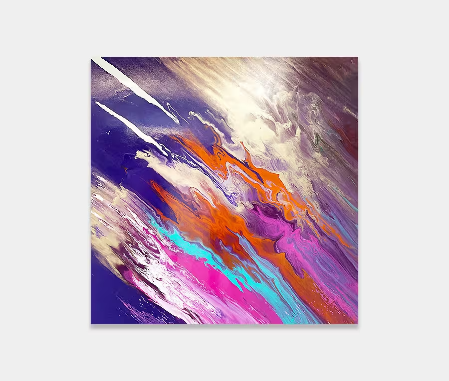
There’s an intoxicating subtlety of colour blending in this original painting that requires a closer inspection to appreciate. Tiny rivers of peach and apricot slither around almost unnoticed whilst infinite grey tones meander round the shapes and twists.
Personally I’d have it on a dark feature wall. A darker background will help show off the delight of the cream background beautifully, but it’s not a prerequisite by any means.
If you’ve got a fairly neutral colour scheme this could work brilliantly – especially if you’re not going for the whole shout-from-the-rooftops thing with your art. The orange is strong but it’s at the end of the orange spectrum that enhances natural materials like wood and earth.
And because it’s large it commands the space it occupies with authority but it’s not overbearing or standoffish. It’s approachable, warm and charismatic without slapping your face each time you walk past. In fact it’s currently taking pride of place in my art gallery and I quite happily walk past it a hundred times a day!

 Heavens Above