Embracing freedom
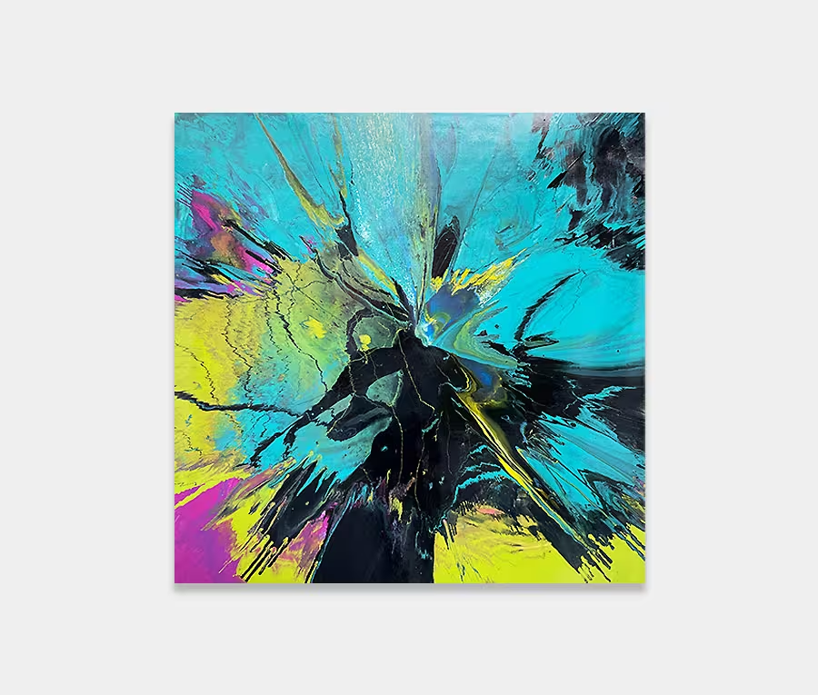
Being able to do as you please brings enormous benefits. No-one tells you what you should and shouldn’t do, no-one barks orders in your ears and most importantly of all you can walk every step with the freedom to do whatever you want.
Of course it comes with disadvantages too but on the whole this kind of thing is where new ideas and concepts come from. And so it was a gap in my schedule that made me go have some fun with blue and orange – a particularly enjoyable combination of vibrant colours. On their own I always think that they are never enough so the addition of pink and yellow was a bold but wise choice.
Bright, happy things
In this composition the painting is subtle. All the bright colours are bordered by varied blends of blue as I like the idea of containing things into neat packages but within that letting them have their own freedom. Besides, if I’d let the pink or range run off the edges the painting would have felt uneven or carried weight in one particular part – something I am always conscious of avoiding.
I also like the way the man colours find a natural tapered stop point that’s brutally interjected by a line of black. It’s kind of at odds with what you’d expect and that, to me, is something I would personally look for in a an abstract painting: the break point. The bit that your eye focuses on the most. It has to fit with the entire piece but only for the purposes of breaking up the composition around it.
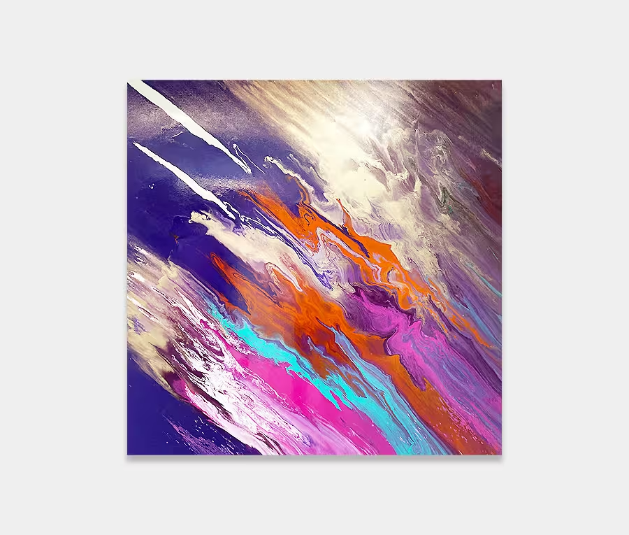
About the painting
And so to the painting. Named after a track by Jean Michel-Jarre it’s a reference to Yuri Gagarin. So the space theme is prevalent once more. If you think of gas clouds, distant suns and stars then you’re already getting a glimpse into the compositional references behind it. I like this abstract because of it’s uncomplicated nature; it’s light, easy to look at and doesn’t take a psychology degree to work it out.
It’s also very organic too. In the heavy areas it’s dense and rich and in the lighter ones you can still see the weave underneath. It’s going to look particularly at home above a sofa or console table and where neutral colour schemes have been introduced.
")
")