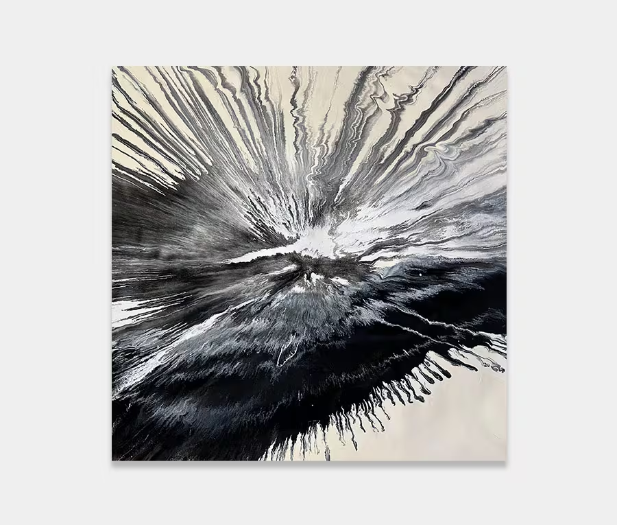
A large square painting in black, white and grey
There is definitely a clock thing going on here, hence the name.
Maybe it’s a reminder to get a move on with life…


")
")

If only we had more
Time; there’s never enough of it is there? I’ll try to keep this to the point and avoid the usual cliches. The painting is based on my abstraction of a clock face, therefore the time reference is entirely deliberate and planned.
People’s interpretation of time and the impact it places upon their lives is a fascination for me. Some see it is a gift whilst others see it as a burden. However, the way in which we perceive it, use it and understand it really doesn’t matter because in the end the seconds and hours are the same whoever you are and wherever you may be.
Alice Through the Looking Glass
The idea came from the character called Time (played by Sacha Baron Cohen) in James Robin’s film adaptation of Alice Through the Looking Glass. The sympathetic and imaginative way his character had been brought to the big screen was something of a revelation; it was just how I imagined he would be from the very brief mentions in the book.
The film is worth it for Cohen’s performance let alone the visual feast of CGI that the screenwriters and set designers conjured up. Just brilliant. Critics panned the film because of Johnny Depp’s performance but I enjoyed it immensely so who cares!
So what’s new in the painting?
First of all it’s got a very deep and subtly textured background layer of white and cream. Placed upon this is a mixture of black, silver, cream, grey and white colours that have been applied with a flat metal blade, mainly working from the centre outwards.
Furthermore, one of my main considerations was to keep a balanced radial pattern to the painting so that there would be nothing too distracting sat in any one place.
If you think about a clock face it’s only really the hands that contrast against the regularity and spacing of the numbers. So I painted the hands in there too; where, though, is up to you to decide. That’s the secret to a good abstract – there’s no rule to say what’s right and wrong, merely your own interpretation. That’s yours – you’ve earned it! Congratulations!
Keeping things simple
The colour scheme was chosen because of it’s simplicity. Base tones such as these are easy to look at and let you focus on all the other aspects of the painting. On that note you may have noticed some very fine detailing in some of the close up photos.
Attention to detail is something I am very particular about. If you’re going to spend a big sum of money on a big piece of art then you should get something that will keep on giving to you for a lifetime.
Ah yes, there’s that word time again.