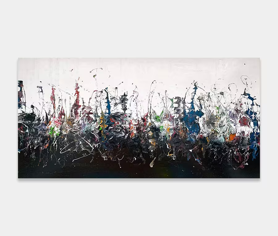
A long purple and yellow art work with beautiful arcs and loops
Everything I love about what I do seems to be in this painting somewhere.
Effortless loops, detailed backgrounds and a mix of colours that really warm your heart.
There’s a lot to like about this one.


THE STORY BEHIND IT
I often talk about my love of colours and the combinations of them. Purists will tell you that certain ones go better with others and so on. Personally speaking, I think that’s horse shit. OK so some will naturally work better than others but very often it’s the ratios of paint and how they are arranged and applied that makes the rules of colour partnering redundant.
With this purple and yellow painting I’m demonstrating just that. Sure you can put any number of colours and variations together but to get colours to work that shouldn’t do requires a little more patience and a degree of practice. And I always practice no matter what.
In this instance I have gone through six small sample pieces to get the shades right. So even at an experimental level I still have to test my theories before I commit them to canvas for real. In the end I got a shade of yellow that’s a little bit melon, a little bit sunset and a hint of canary thrown in. But then I knew that this was not going to be enough on its own, we’ll talk about the role that complimentary colours play shortly.
Let’s mention the purple, oh yes, my beloved purple, I use this colour a lot in my work and normally stick to just a couple of stock shades – they’re the ones that work the best. However, for this painting I yet again tested a number of shades specifically to work with the new yellow. It’s funny but I see colours in terms of their warmth and accents hues – much in the same way that a master distiller will pick up certain key notes in, for example, tasting a single-malt whiskey. I’ve listened to someone talk of honey, almond and a chocolate being present at different points of the tasting – how wonderful is that! That kind of thing fascinates me even though I never touch the stuff.
I look for these ‘notes’ in my paints too; this purple has a hint of red at its top end, a stab of lilac in the mid tones and a silvery-grey base tone at the bottom. I build the paint this way to compliment the other colours that surround them and to help pick out highlights in the other colours. For this piece of art I needed a purple with a little solidity and maturity so that the yellow, red and white had a chance to shine. Mixing with ‘notes’ is a whole heap of fun.
So you can see that it’s a lot more than opening a tin of paint and smacking it onto the painting. I am very considered when it comes to what tones need to be added or taken away to get the best out any particular arrangement.
And then we come onto the pink. It’s a great example of what I was referring to as a complimentary colour. Whilst it may be secondary (like the odd gestures of red and silver) it plays a crucial role in the story of the painting. On the whole, secondary (complimentary) colours tend to show off the main colours better whilst adding to the depth of the overall composition.
That pink (Telemagenta to be more precise) is a daring dash of fabulousness that rushes around like whirling dervish. In this painting it’s the single application colour that brings it all together; it’s carefully applied and tentatively placed. And it works beautifully. Sometimes it’s the end notes that make or break a painting like this.
Always and Forever was conceived and created over six sessions and is made up of four distinct layers. It’s warm, sunny and ever-so slightly mad. It’s elegant with a twist of rebelliousness and because it isn’t massive I can see it slotting in on a wall space where some fun and a dash of life is needed.


")
")