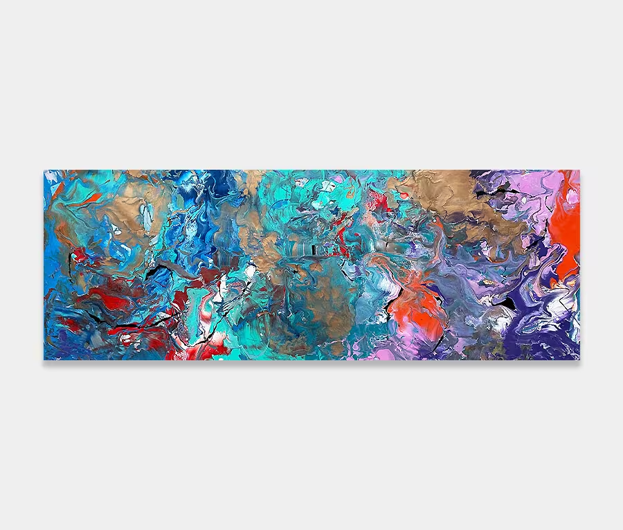
A green and blue abstract painting with purple and black tones
Is that the ocean I can hear?
Gentle waves crashing along a golden sandy beach?
Let it be whatever you want it to be…
Is that the ocean I can hear?
Gentle waves crashing along a golden sandy beach?
Let it be whatever you want it to be…


The use of green and blue in my work is a rare thing. In fact I can only think of two other paintings to feature such a rich combination of colours and that’s from a 10 year time span so these are are even by my standards.
So it’s with enormous pleasure that I give you Deep Blue Something. The name came after the painting was complete and was suggested to me by one of the members of my focus group (who also reckons it looks like a tropical fish tank!). Making a connection to such a strong visual reference is to be expected – it does resemble a fish tank I guess. But I’m sure you can see other things too perhaps?
The painting didn’t start out that way though and I never had any thoughts of creating a painting with references to water or marine life. My motivation was a lot simpler than that; to create a series of forms that exploited the beauty of the new colours I’d just bought. In particular I refer to the lime green that seems to dominate the whole painting.
It’s an odd thing really as there isn’t that much of it on the canvas, yet it’s the bit that draws your eye as you first begin to look at it. There are other supplemental colours at work here too; water blue, Swarez blue (my own metallic), purple, black, white and three other greens. They all play a supporting role to the main event – lime green.
Movement is important in all abstracts. If anyone tells you otherwise then don’t listen. It’s down to how our brains perceive reality and how it has the need to disassemble something with no visual hook. If our eyes remain fixed in one place then our ability to asses and make sense of the whole composition can be significantly hampered. If this happens, the chances are that we won’t be able to work out what’s going on and the painting will be lost.
However, creating shapes and colours that let your eyes move freely, and without obstruction, let our brains gather more visual data to process. The net result is the ability to understand, like or dislike an abstract very quickly. Movement is critical because it also lets a painting unfold and reveal itself rather be confined to a determined set of parameters or the same piece of canvas where all the interesting stuff happens.
Easy. No, really I mean that. I’ve popped a few examples of what this might look like in a room setting above and I think it’s quite clear to see that it will happily hang almost anywhere.
It doesn’t matter whether your dining room has grey walls or that space behind your sofa is looking a little empty – this painting is a great size to begin with. Its proportions make it ideal for long spaces whilst the generous colour palette can fit into any neutral scheme. It retains an air of maturity and calm amidst the wash of bright oceanic colours that are at play here.

 Crossfire Hurricane