Lines are your friends
It’s hard not to like lines and stripes but it can be difficult to love them. Now whilst I appreciate that the humble line may not be something you’d look for in an original painting it can certainly fulfill our need for order and organization. In life we have a requirement to operate with some degree of structure (generally speaking) as it helps us to manage the process of living. Having things neatly placed into routines, physical spaces and in the way we interact with others is fundamental to our way of life. Lines define our boundaries, our limits and our spaces.
So how, you may ask, can this undramatic and regular system of order ever be turned into something that excites or involves? Well, it’s something that’s actually made up of several different components that, when brought together properly, create something rather wonderful.
Space, frequency, size and colour
The way I see it a humble line is just that. Something that sits on it’s own with no relationship to anything else. Its properties are mostly contained to where it’s come from and where it ends up. Add another line though and suddenly things begin to change. Now you have a relationship between the two, even if at this point it’s hardly remarkable. Let’s say you now put a wider one in next to these two. What happens then? Now we have a more dynamic relationship between these three simple movements. It’s no longer about existing in isolation; now they all have each other to respond to. It’s at this point you begin to form your own reactions to what’s going on.
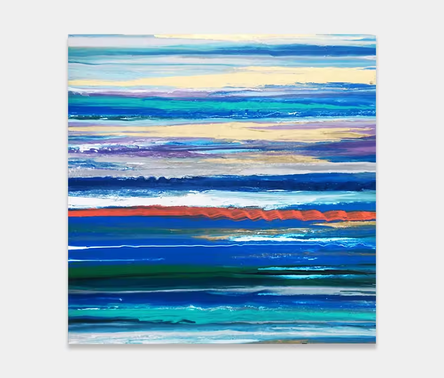
This is the basic premise on which all my lines paintings are created and constructed – on a simple relationship between three objects. If you look at the photos you can make out that all the main stripe groups are arranged in threes – two small and one wide in each plus accented other stripes that are blended around and in between them.
If you put in another variable like distance things get even more interesting. Playing with the space between lines is enormously revealing and very often it’s the emptiness between them that reveals the most. Artists call this negative space. And very often it’s this very dynamic that has the ability to alter a painting in a heartbeat. Sometimes it’s the very nature of what isn’t there that becomes more important that what is there. Staying with me so far? Excellent. Gold star to you.
Let’s get a bit more risque now by adding the crescendo we know as colour. We all know how colour defines our moods and emotions and how we all have a reaction to it, both on a conscious and subconscious level. This addition (and perhaps one of the most critical for me) is the bit that makes or breaks a lines painting. I have to make this my primary consideration when I am planning out these artworks as that very often dictates the ratios and relationships of everything.
The big red stripe
In many ways the lines paintings are more tricky to get right than the others. It’s because lines are absolute and not open to interpretation that essentially constrains me to a pre-determined layout before I start. So the only way to open them up (to as big a reaction as I can) is to introduce space, frequency, size and colour. Sure I can go the opposite way or at angles but that’s not what mine are about. Instead I want to keep this linear and structured approach and see how far I can push it without breaking it.
So in this piece of purple abstract art I’m using red and pink as my main focus. It is perhaps the red colour that is the most fundamental to the success or failure of the painting. Its very existence – offset and wider than all the rest – is deliberate. Too far over and it becomes unbalanced and heavy, too wide and it becomes overbearing and absolute, too narrow and it gets missed. The success of this painting is down to that single red stripe. And if you want to test that theory then put your hand between your screen and eye and block it out for a moment. See what’s left? Nothing wrong with that of course but it lacks character and depth without it.
It’s actually the red stripe that is the negative space in this painting (still with me?). I’ve used this colour as the stop point, the break point and the focal point all in one hit. Neat right? The principles are remarkably simple when you understand how to use them but if you get them wrong you’re in big trouble.
So I hope you can begin to see why I love painting these so much and why you really can live with lines if you choose to do so. For me they are probably more revealing than any other style I work in because they have such a complex story and technique behind them. I know for a fact they’re one of the most difficult and involving.