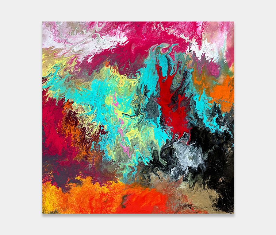
Careful with those tools!
Choosing an application technique to match a specific colour has resulted in the use of six or seven tools with each colour being mixed to suit.
So the sunset yellow has been applied with one tool and mixed with a certain cocktail of additives whilst, for instance, orange has gone on with a different tool and then subsequently mixed with another series of additives to make it do what I need it to do.
Sorry if all that sounds confusing but I just want to illustrate how each colour (and method) is specifically designed to do a job for that colour only. It gets a bit confusing for me too…
Happiness with an edge
So let’s imagine for a moment a world full of happy, bright colours. Remember Kaleidoscopes as a kid? Or how about walking into your favourite sweet shop/candy store? Happy days for many of us no doubt. And creating something to trigger memories like that is a truly wonderful thing to do.
Except I haven’t. And quite deliberately too. No, for this one I wanted to give it a much darker edge. To do this required adding a number of chemicals to my (usually) very bright and perky colours.
What this does is change the luminosity of the pigment. In real terms it lowers the brightness but not the intensity.
So what you end up with are powerful but mildly subdued colours that contain this fabulous depth to them. It’s actually been quite difficult to tone down bright colours yet still pull off a multi-coloured painting with the drama of this one.
It’s one reason why I have failed on four previous occasions. I just couldn’t get the ratios right – it was simply too damn dark.
Persistence pays off
I’m super-pleased with how it dried. It’s got everything in it – from warmth to cold, from dark to light and textures of paint that absorb and reflect light. If you’re looking for something to brighten up a space, but also remind you that a little bit of mischief is okay once in a while, then drop me a line and let’s talk.


")
")