A mustard yellow and grey art work with hints of lime and black
This painting’s outwardly relaxing swathes of easy-going colour hide some rather wonderful detailing.
190cm x 110cm (75″ x 43″)
This painting’s outwardly relaxing swathes of easy-going colour hide some rather wonderful detailing.
190cm x 110cm (75″ x 43″)


These two colours are a favourite combination of mine and I always look forward to painting with them – albeit on a a far too infrequent basis. Yellow colours can exist in all kinds of temperature and tonal ranges – from cold pastels to hot sunsets.
In the case of this particular mustard colour I’ve gone for a mix that has hints of warmth (as well as cold) coupled with an overtone of lime and an undercurrent of lemon, to give it a little sharpness.
The lime accent is further enhanced with a few carefully selected applications at strategic points on the canvas. Additionally I have also extracted some of the other mustard components and featured them too – there’s that sharp lemon I was referring to as well as a mixture of melon yellow and golden tones sneaking around.
The role of grey here is to act as a calming and grounding colour. Something to stop everything ruining away with itself.
It can be difficult deciding in what orientation to place a painting – especially as a lot of abstracts don’t really have a preferred way of hanging. In many ways this is a good thing as it lets you change the dynamic (of the space it’s hung in) at any given point.
For many of my paintings there definitely is a preferred way to hang because they seem to just work better in some orientations than others. With Harmonic Tremors I would prefer to hang it in portrait with the darker part at the bottom, letting the colour and lightness rise towards the top. But I’ve hung it in every way imaginable and it always looks great.

Adding detail is a critical part of my ethos. I want my work to engage on all kinds of levels but for an owner I feel compelled to give as much as I can in every painting.
I want the artwork to keep giving and revealing itself as time moves on. My desire to add layers and effects that only show in a certain light (or at a certain angle) is consuming and I have developed techniques over the years that do just that. Doing this with a reasonably low number of colours, however, is always a big challenge.
This is one of the reasons why I decided to break down the mustard yellow into its component parts – it allows me to do more with the detailing. So no matter what angle or distance you view this from there’s always something to look at – even if it just looks like a mass of mustard on first impressions.
Historically I’ve not given any kind of crap about being able to fit an artwork into a colour scheme or space (except for commissioning clients who have what they want). However, as I installed a couple of original mustard yellow painting during 2017 it became apparent how well this colour worked with wood.
It appears to fuse the natural, elemental quality of wood with the nuances of a contemporary artwork. I still think you have to get the right shade and tone but, that aside, mustard works brilliantly in bringing a traditional building material together with 21st century design. And when that appears in the form of a painting all those elements become one.
And it never ceases to amaze me when you hang a painting for a client and it looks like it’s been there forever. That’s the power of a good abstract.

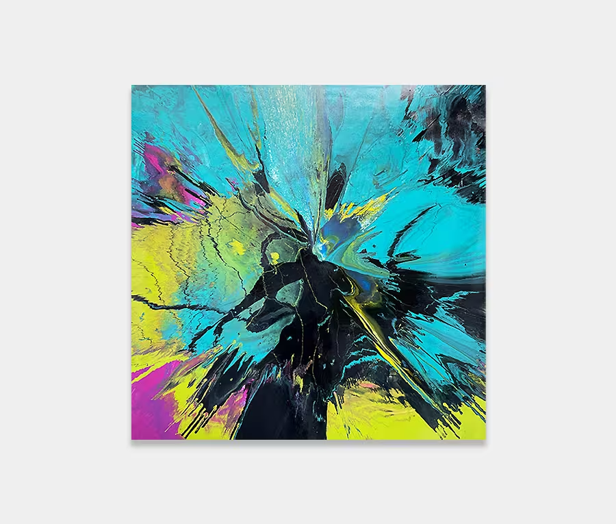
 Jackhammer