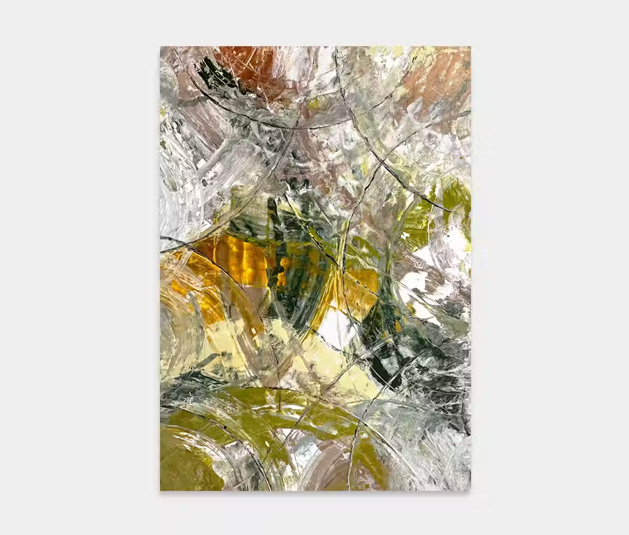
A large black and gold painting with contrasting neutrals
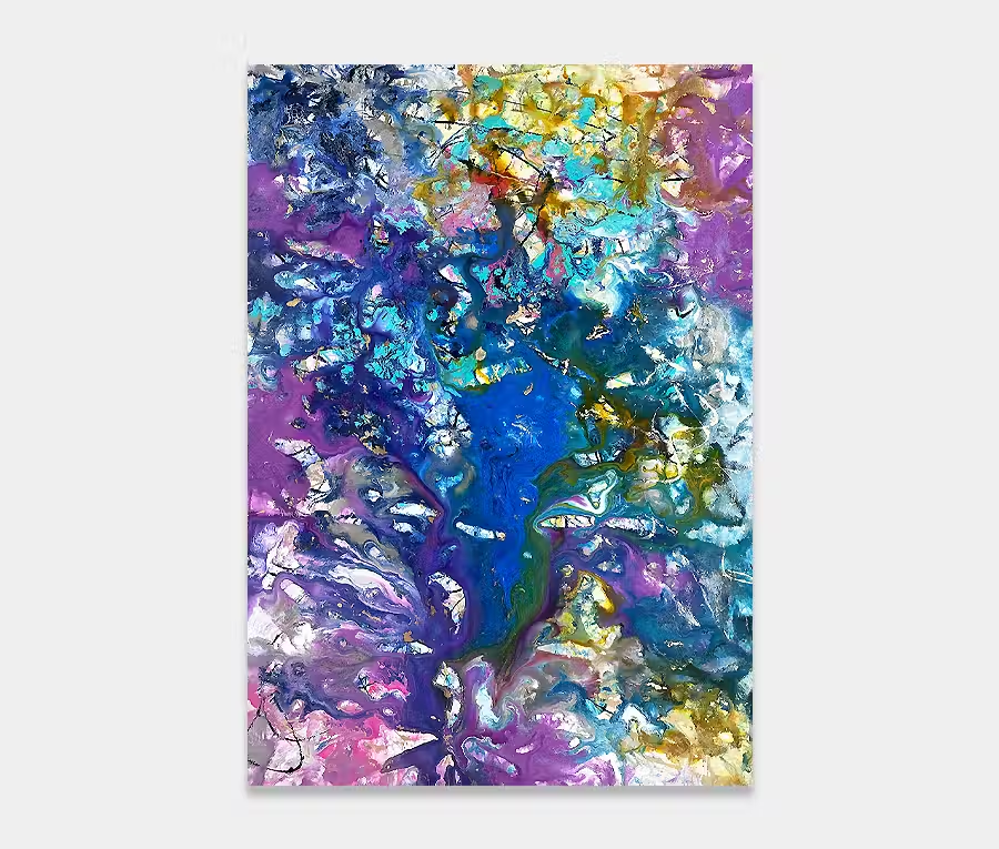
Ah yes, light and dark. Two opposites that feature so heavily in my work.
Fractious, but never as apart as you may think.
This painting is just beautiful and perfect where colour is not the priority but drama is.

")
")
")
THE STORY BEHIND IT
Let’s be honest, if you’ve read some of the text that goes with some of my other paintings you’ll be familiar with the whole light and dark thing so I’m not going to bang on about it again. Suffice to say that this is perhaps the most obvious example of the principle of light and dark that I’ve done for a while.
Not that this is all about turmoil or doom and gloom, despite the slightly imposing title, no, this is simply about the acknowledgement of the two extremes and that they can exist perfectly happily in either state or as a constant alongside each other. So that’s the psychology done with.
So let’s get on with the cool things.
The enamel paint is always worth a mention. I have expanded my paint recipes recently to include a fifth supplier (and bear in mind that all bar one provides me with bespoke paint). I’ve used a new gold blend in this one with a 40 micron metallic powder. To put that into perspective I normally use a 100 micron version. The effect is to deepen the lustre and bounce light back in a slightly more concentrated way. I can’t scientifically prove this as I don’t have the equipment to measure it but after many years of painting with metallics I can tell you it’s unlike any other gold I have ever used. It’s absolutely gorgeous. I’ve not gone mad with it though as it can get too much. Instead it’s got it’s highlights and also a number of important blends with the other colours too. Got to have some balance.
In addition to the gold I have also added a new copper of the same specification. That’s magnificent too. Where white and cream meet darker tones the blends and gradients are, in places, brutal yet in others seamless. Even in the blending of similar tones I still have contrasts between light and dark. The devil really is in the detail and I promise you right now these concepts have to planned beforehand otherwise you just get grey sludge. Trust me, I still have those days…
Again I have featured selected rivers of paint throughout the painting, something that is becoming a recognizable feature of my larger works. These are applied with syringes and needles to accurately define the size and shape of the flows.
The finish is beautiful – achieving a contrast between high gloss, semi gloss and matt finishes. The way this painting interacts with light is a revelation even to me and I know what I’m doing. But please consider this: to get the most from it you need a source of natural light and a directional spotlight for the evenings. You really need to see the gold and copper in this painting to appreciate it. And for that reason alone it’s worth extending your kitchen and putting in a glass roof!