An abstract striped painting with defined landscape references
Lots of colour, drama and subtle nuances. This is a deliberate landscape-inspired painting that features wonderfully rich shapes and colours.
Lots of colour, drama and subtle nuances. This is a deliberate landscape-inspired painting that features wonderfully rich shapes and colours.

")

I love abstract striped paintings although I’m not generally one for landscapes, if I’m completely honest. However, this painting was deliberately constructed and created with a landscape in mind.
I don’t know whether this is because I’ve recently been on holiday (at long last – my first in three years), or quite where the inspiration came from; but there is something very re-assuring about lines, horizons and points of reference. I think that’s one reason why we love landscapes so much – we associate very well with them.
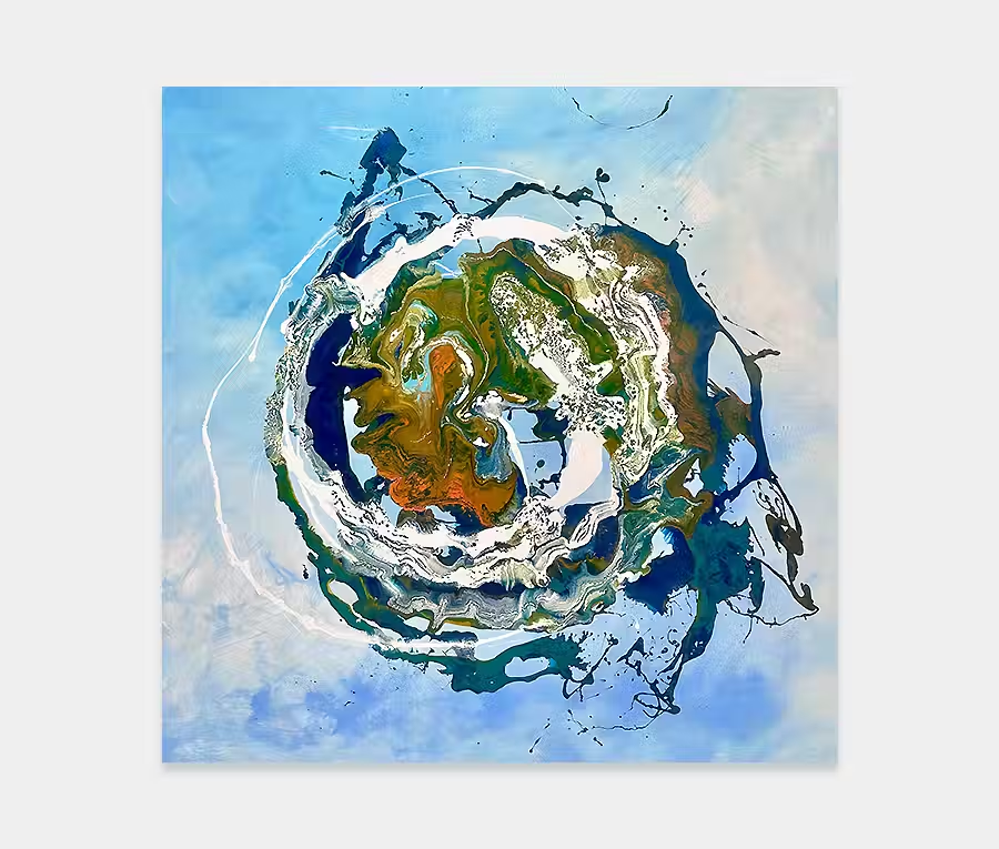
In Heavens Above (titled because of what looks like a very large amount of sky) I’ve taken a number of different reference points and put them all together. This is in the hope that your eye can start to work out which bits might be sky, which bits might be land and the bits in between you need to make up for yourself.
In this new painting, one of the most important areas is the silver and black. You may see from the large black application going from right to left towards the centre of the painting, that this is perhaps the heaviest part of the entire canvas.
However, this, on its own, doesn’t work; it needs to have something else with it for you to be able to use it as a reference point for the rest of the painting. So it’s with the mixture of silver and black that this reference point is created. For me that looks a little bit like rocks, or an estuary, or a headland or something similar and above it floats these wispy, wonderful, almost ephemeral silver-like clouds.
Over and above that (and this is where the title comes in to play), we feature gold and lime streaking through the sky, all tempered with this gorgeous Cadbury -purple fused with a deep blood red orange and crimson across the top. Now, whether you think this is an alien sunset, or something from outer space is up to you. Even if you don’t see it as an abstract landscape at all the painting succeeds because of its variation of colour.
So if you’re thinking about introducing something like this into your life you’ve got the safety of neutral tones but also a waft of bright colours for you to enjoy and be empowered by.
The paint applications are quite thin in some places and quite thick in others, so as light hits the surface it reflects in different ways. This helps add a textural element to the painting as you walk from one side to the other. It will also help if it’s going to be positioned opposite a light source, as some of the thin areas will absorb light and some of the thick ones will reflect it.
But the thing that I think works best of all is that, although it looks like a bunch regular structured lines, it is in fact a sequence of heavily deconstructed lines. So, as you walk in closer you lose that element of regularity and you become more familiar with the individual shapes that the painting is composed of.
Stand back, or enter from the other side of the room, and the lines become more apparent again. This particular piece of artwork has a very uncanny ability to change, depending on where you view it from. Pretty cool.
Ideally, this would be suited behind a sofa, or it could be put in a dining room with a long table. Easily fitting into a dining space, it isn’t a painting that’s going to upset your dinner guests, or make them feel ill over the soup course. Equally, it contains all the dynamics and joy for life that my paintings have become so renowned for.

 Swept Off My Feet