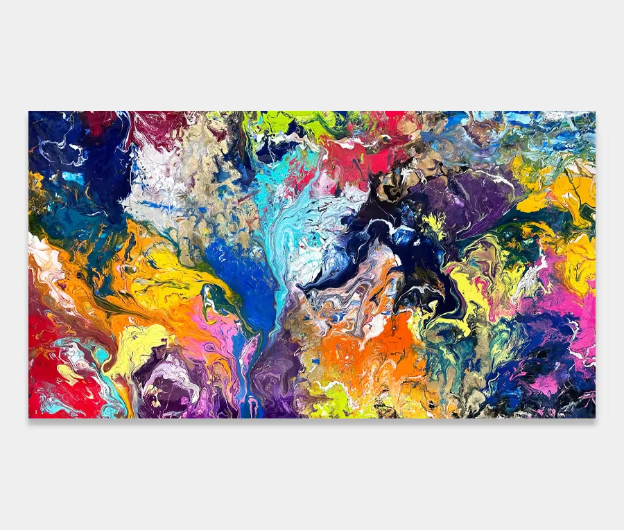
A long turquoise abstract art work featuring a range of beautiful primary colours
This is all about the combination of deep, rich colour and that all important sprinkle of gold dust.


")
")
Using turquoise in abstract art
It’s an interesting colour. Personally I think we should see more of it. In the right hue it’s powerful, deep and rich yet can also be restful, relaxing and ethereal. It conjours memories of tropical lagoons and of the overcoats my mother insisted I wore as a kid.
Like many unusual colours turquoise sits on the outside edges of most people’s colour spectrums. Often it’s only used to accent or tone down other more stronger colours. However, with the right accompaniment and ratios it can be one of the most beautiful and revealing colours to work with.
Keeping everything in check
Though I base the story of this painting around one colour you’ll notice it’s not the star performer here; that accolade belongs to the mass of purple that lurks unapologetically in the middle of the canvas. And like all the other surrounding tones it is controlled and kept in check by turquoise.
It’s this colour that makes everything else work – that’s the reason why it’s the main topic of conversation with Thy Will Be Done. You could argue that I’ve used turquoise to tone down the strong colours like I’ve already mentioned but I don’t see it that way because there’s just too much of it lurking around to have been considered as an afterthought.
Indeed it’s the very place I began – I added turquoise at the very beginning before any of the primary colours were applied. Giving a tertiary colour like turquoise a stage is a good thing; it’s a very underplayed colour in my opinion.
Bring in the gold
I seem to be having something of a gold renaissance at the moment. I think it’s because of a new paint formula I’ve had done. The tiny metallic flake is stunning as the light catches it so now I find any excuse to use it.
In Thy Will Be Done it’s used in very small quantities and applied with an atomizer that’s got a nozzle just big enough to let the metal flake through. It’s a beautiful effect as it’s just enough to bring out a few focal points in the painting without it looking like a Moroccan Bazaar on Saturday afternoon.
The C Word!
Relax, I’m talking about consistency. Since this abstract painting is really just a load of coloured shapes it’s essential to have some consistent techniques running through it.
This is because our brains require something to pull the component parts together into a single mass. This kind of linking behaviour is instinctive and helps us make sense of the world around us – particularly when we encounter something we’ve not experienced before.
Processing the things we see
To help your brain anchor itself I’ve done two things.
The first is to chemically induce a series of small blooms. These show themselves as tiny circles or dots. You can see them from whatever distance or angle you choose to look at it from. Therefore the dots are a constant across the whole canvas.
The second technique is to use a very subtle up and down movement to create the illusion of lines. Our brains like regular repeating patterns. We assemble information from chunks of data we receive from our senses and consequently our brain works it all out from there. Clever stuff if you stop to think about it. The regularity of the world is all around us.
But who cares about all that?
Of course you could read all this and think it’s the biggest load of bollocks you’ve ever heard. That’s fine too. You only need to listen to the little voice inside to know if you like something or not – everything else literally is bollocks! Whatever your reaction I really do like this piece of turquoise abstract art; it’s something I’m going to try on a much larger scale soon. Just for shits and giggles.