Using blue and gold
Blue and gold are rapidly becoming my favourite colour combination. I’ve written extensively about their regal properties and opulent qualities.
It is, however, the inclusion of certain other colours that’s really opening up a world of infinite possibilities. With each colour I try I’m changing the behaviours and feel of a painting and I am eager to try as many combinations as I can. In this painting I have chosen a light aquamarine as the accent colour.
Up and down and side to side
You can see in the photos that the painting works brilliantly in either portrait or landscape orientation. So it’s really a matter of choice as to whether you prefer the movements going from top to bottom or from one side to the other.
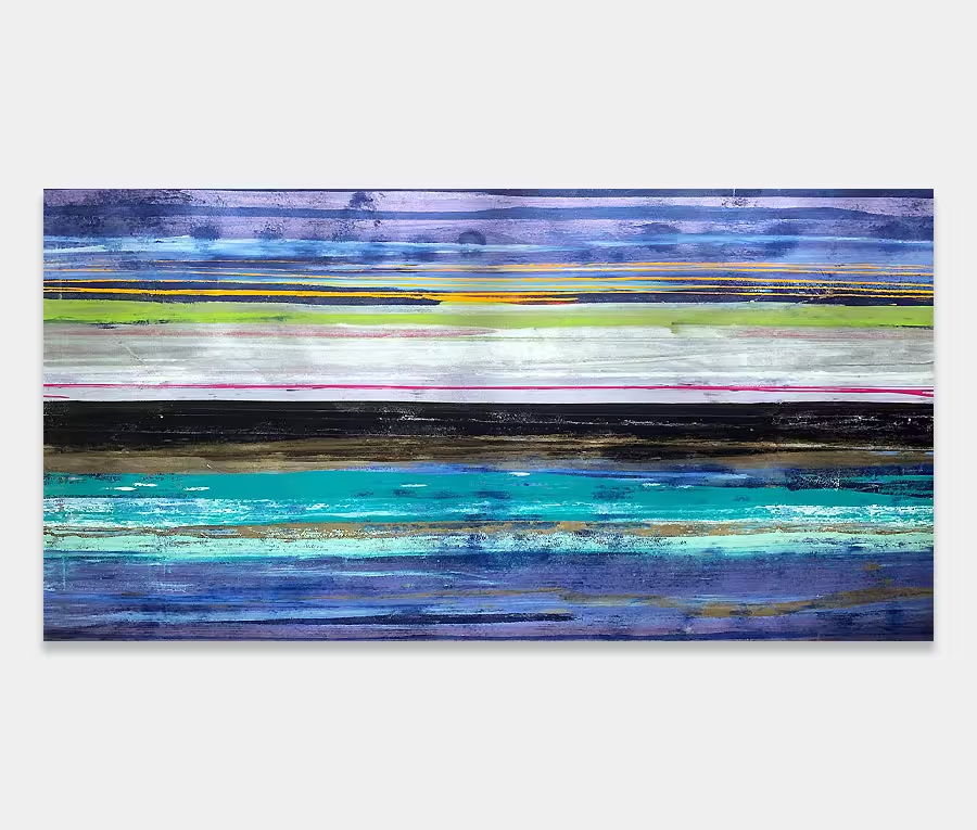
Turning our attention the black part for a moment you can see from the close-ups that this is a detailed and complex series of movements that’s peppered with tiny fragments of metallic gold.
This breaks into a graduated fade to grey and gold as you move your eyes along. The grey parts are incredibly important as they act as a mid-way point between black and blue (it’s actually a variation of aquamarine).
It can be important sometimes to have a couple of break points in a painting that stitch some of the extremes together; this often makes for a more seamless visual experience.