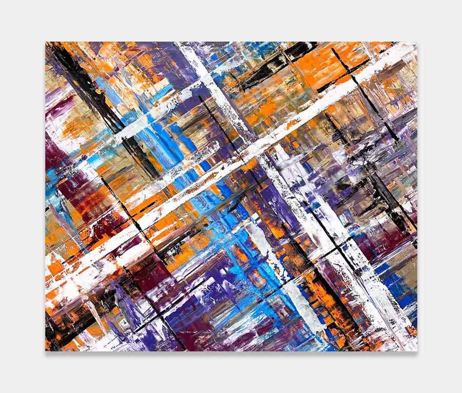
A large blue abstract painting made up of lines
I really get a kick form painting with regular shapes.
There’s something so appealing about using regular shapes to construct something; maybe I should have been an architect!


Big and Blue
There’s no getting away from the fact that this is quite a large abstract painting. However, you’d be surprised to know that you don’t have to have an enormous room to hang it in. Sure it helps but as long as there is wall space those beautiful blue colours and blended additional tones keep the painting calm, contained and like a snapshot of the sky whenever you look at it.
I’ve done a few like this recently as I have enjoyed exploring a new dragging technique; something that can only really be explored over a large surface area of canvas.
Construction methods
The base construction of the painting is a series of lines drawn out evenly from both sides to meet and cross over in the middle. Some of those initial drags will make it further over to each side than others as I tend to alter the flow rate of the paints to make sure I mess things up a little. By this I mean that some of the colours need to be more fluid to allow me to move them over a longer distance.
The downside to this is that they also become thinner and therefore are more likely to be lighter and show up the weave of the canvas underneath. With this in mind it’s always a concern that I have to get them overlayed as quickly as possible. Timing is critical in this phase as the thinner the paint layer the shorter the skinning (curing) time and therefor the less opportunity I have to get them blended with what I want to lay over the top.
Painting on a big scale and with these paints is not something I find easy. It can be stressful if I don’t get the timings right.
Adding the top layers
Additional layers are placed on top and these are made up of opposing lines of colour – pressed on in blocks of varying width and length. I tend to use a single black and white for these overlays as they are a great contrast to the layers that form the painting underneath.
This is perhaps the phase I tend to take the most time over. This is because a wrong line somewhere will mean the rest are put in jeopardy and the painting runs a serious risk of becoming unbalanced and offset; something I would find very difficult to accept.
So the four shades of blue, three purple and elements of orange, grey and black give us very linear and controlled piece of art. I can see this feeling equally at home in a newly renovated kitchen/diner or larger hallway or living space.