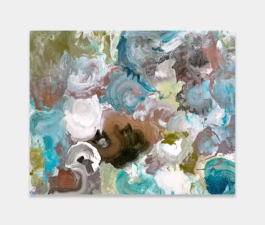
A rectangular orange and red painting inspired by geology;
featuring cream, gold and grey accents
I could talk for weeks about how nature provides most artists with an endless inspiration for new things.
But instead I’ll just get on and paint the things I am enlightened by;
And who can argue with the magnificence of geological sediments and rock strata?
")
")
")

So what’s the inspiration for it then?
No prizes for guessing where the idea came from for this new orange and red painting. Rock strata.
It was a recent documentary on National Geographic that really made me sit up and take notice. In fact it was a story about sedimentary deposits in Patagonia and how the dramatic and varied landscapes were formed; all beautifully captured in HD and revealing the most stunning colours and shapes. We’re used to seeing a lot about places like the Grand Canyon but less so about some of the other spectacular mountain ranges and rock formations around the globe. Here is a photo by Black Diamond Images taken from the region and is just one of the many highlights of this incredible geological area.
So being able to capture lines and show a clearly defined structure was the foundation for the painting. It is, however, the choice of colour and the ratio of how much to use that really brings this artwork to life.
Notes about the colours
I am always extremely careful with colour, even though it may often look like the opposite. I have learned the hard way that too much or too little in the wrong place means instant disaster. Getting the right balance is absolutely critical in everything I do. So for this painting I knew I needed red. That was a firm decision right from the start. But it was always going to have to be a suggestion rather than a liberal dollop. It was needed so that the painting could have a break point but also to help you see all the other colours too. It’s an odd principle (and I’m sure it has a name attached to it) but very often you need a single flash of colour to help you see all the others.
From a distance it looks like a very simple painting. As you get closer though the details begin to appear. And that’s very important for a painting like this as it really needs to keep you entertained and engaged form all angles and distances. In among these details are some notable additions – there’s a rather splendid silver-grey peak and a curious spurge of orange mixed in with all the back and forth movements.
Unusually for me I decided to put some chocolate brown in too. I hardly ever use brown or its derivatives but in this instance it gives a little solidity and grounding to the other colours around it. Maybe a little like the earth that the mountains rise up from; everything needs a solid foundation.
Looks pretty easy on the eye?
Yes. It’s a beautifully easy-going piece. Lot of colour, plenty of neutrals and because it’s grounded it will never feel like it’s going to take over your life. I think you can make this into a lot of things if you want to and not just let it be a painting about rocks. As you can see from some of the room settings on this page it’s never going to fight you for attention but it will give that all-important splash of colour to a space.