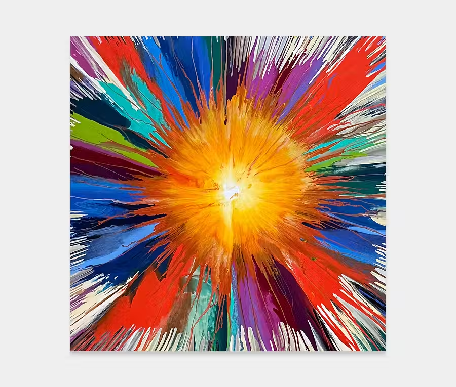
A stunning original blue, orange and red art work
Think Hawaii, surfing, volcanoes and lava.
Take yourself off somewhere warm where the breeze blows in your face and the sound of the ocean caresses your ears.

")

")

THE STORY BEHIND IT
Well here’s a new thing for me; yet another new application tool. May not seem like much but when I get an idea sometimes the only way translate that into a completed painting is to come up with a new way to get the paint onto the canvas.
For Red Clay Halo (named after the group of musicians that record with Emily Barker) the idea was a relatively simple one: lots of repeating shapes, built up in a wave of colour and moving at a diagonal across the painting. Three rules to govern the composition. I could have opted for traditional methods of applying paint but I was very aware of wanting to create this wave-like form across all areas so I resolved myself to the fact that all the current tools I had wouldn’t be suitable for what I saw in my head.
The inspiration for the painting comes partly from research into the geology of Hawaii (think volcanoes, lava flows, steam, ash clouds and magma – you can probably begin to get a mental image of these elements). If you add in the surrounding ocean you essentially have all the colours you see in the painting. It’s this richness of many things that makes Hawaii a mecca for people of all interests. I like that it has it’s own unique identity in all aspects of its existence.
I have two very cool and dear friends who talk a lot about the quality and uniqueness of surfing in Hawaii; this is the other part of the inspiration for painting Red Clay Halo. The surfing reference is actually what led me to conceive this painting as a collection of waves; hence the need for a new tool to create them.
Anyway, back to the painting. So, like I mentioned, Adrian (my colleague) made me a very precise applicator about 13 inches long. Into this I carved very tiny grooves of unequal depths. The bit I’m not revealing is what the applicator was made out of but it had moderately porous qualities to soak up any residual paint that wasn’t required – so it’s kind of like an ‘put on and remove’ kind of thing all in one! Very clever but only really for this style of art. Having said that I plan to do more when time allows as there’s something very compelling about this and most unlike my other paintings to date. I think the technique has mileage and maybe a venture into other sizes and colour combinations could be worth pursuing.
One of the things I can’t show in the photos is the way in which light reacts as you move around it. In fact there are some very subtle high and low points to the paint; it’s where the thicknesses vary as I have applied and removed. It’s always a planned theme in my head to add this extra dimension to all my work and, though not always successful, on this occasion its another cool twist to an already feature-packed attack on the senses.
Owing to it’s gorgeous red, blue and orange colours this is a painting that will pretty much hang anywhere. Neutral schemes, black and white, minimal, eccentric, traditional – there aren’t many environments I couldn’t see this hanging in. It’s also as remarkably calm as it is exciting. For me there’s just enough going on and just the right amount of abstraction to make you stop and look but nothing too overboard that it makes you feel uneasy as you walk past it.