The colour choices
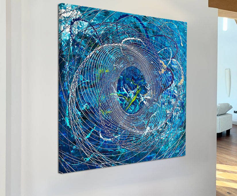
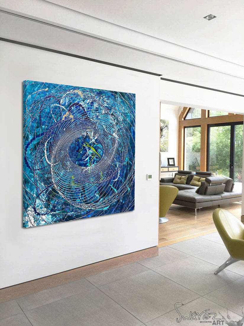
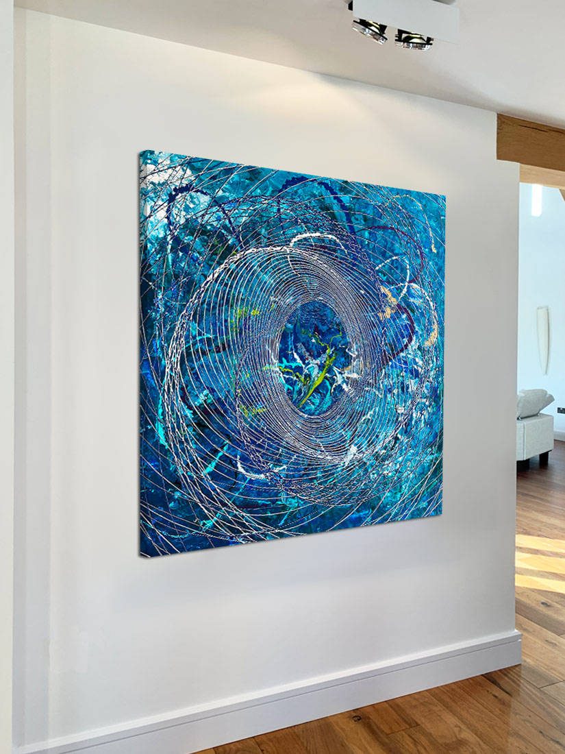
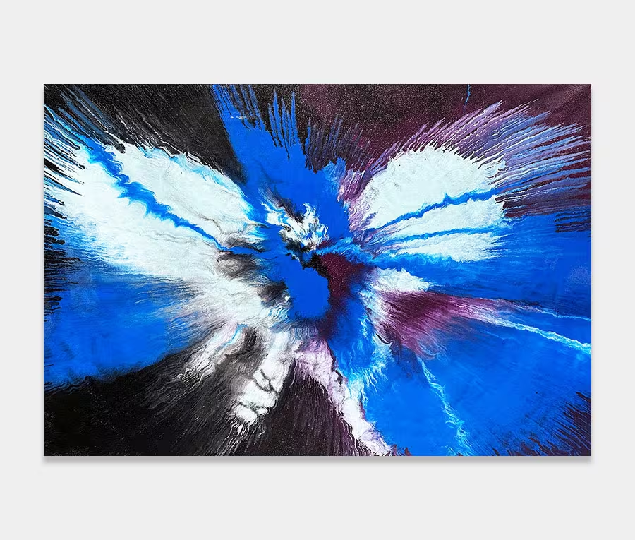
Deep Blue is a square abstract painting that features a blended mix of aqua green, metallic blue and splashes of lime. Added to that are flashes of gold, some metallic purple, Piaggio Verde green and a few hints of white.
This is a colour combination I love working with as it makes me think of the sea. I have no connection with the great oceans, but they are an endless source of fascination for me, nonetheless.
The big spiral
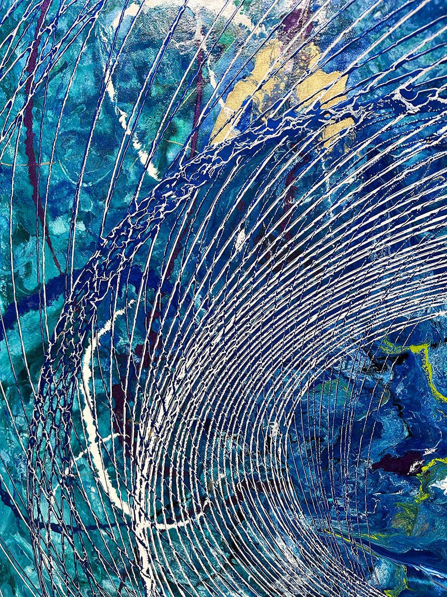
This wonderful base layer then sees an ever deceasing spiral of paint placed upon it. It’s a mixture of white and blue paint that has been forced through the same hole as it was applied. The result of this is to create a single line that contains both colour paints at the same time.
They’re not mixed though – they remain separated. So, what you get is an effect that’s effectively another spiral; and that’s within a spiral anyway so how’s that for originality!
Contrasts
This spiral layer is a beautiful contrast to the base ayer as it’s very uniform and regular compared to what lies beneath. I like this juxtaposition a lot. When you stop and think about it for a moment it’s like comparing the regularity of the tides with the crashing of waves, for example.
One is randomized and the other regulated and this is very much how I feel when I look at Deep Blue. So the inspiration from the oceans is more than just in colour alone.

