A gold, blue and black painting featuring white accents
I’m not sure if it’s the gold or the white that makes me think of a city in the frozen tundra; whatever it is though it’s an uplifting and very fresh artwork.
I’m not sure if it’s the gold or the white that makes me think of a city in the frozen tundra; whatever it is though it’s an uplifting and very fresh artwork.


Gold and blue always make think of something majestic and regal. They are the colours I predominantly associate with royalty.
So combining them into an abstract painting places me in a tricky position; the need to dispense with the associations my brain already has is an exercise in extreme concentration.
To that end though I stuck to my game plane and created this very refreshing art work that features, at its heart, a stunning flow of metallic gold.
As with so many of my original paintings there’s this whole light and dark thing going on all the time. So it’s reassuring that in this painting it’s the gold that manages to bring those extremes together.
My focus group see it as a city in the frozen tundra as it rises through the snow and ice. I can almost imagine some futuristic time when we have populated our poles and propagated the landscape with our efforts to colonize these most alien of environments.
In many ways I’d love to be around to see it but for the main part it terrifies me that we continue to rape our beautiful planet.
The gold paint is a specially made item and features a super-reflective powder that catches light in the most wonderful ways. I think you’d really need a couple of directional spotlights to get the most out of it.
The we have the shade of blue that I love to use above all the others – it’s another bespoke colour unique to me called Swarez blue (there’s a shock!). Again it has this rich metallic element that’s designed to catch light.
Without the use of blue, the painting might struggle and feel too cold. So even though blue can be quite a cool colour, its use here brings warmth. It never ceases to amaze me how colour can alter the way we feel about things.
On The Edge of These Snows is one of those rare paintings that can literally be hung in any of the four orientations it’s possible to hang it in. Upright in a stairwell or maybe flip it 180° and make it look like gold rain or a chandelier?
Have it landscape and you get a progression from dark to light (or the other way round); perfect for the feeling of movement left or right as you see fit.
I could see this in a library or snug, nestled among wood and slate. Or perhaps a very white open space where neutrality is key but the need to exercise a little individualism is required.

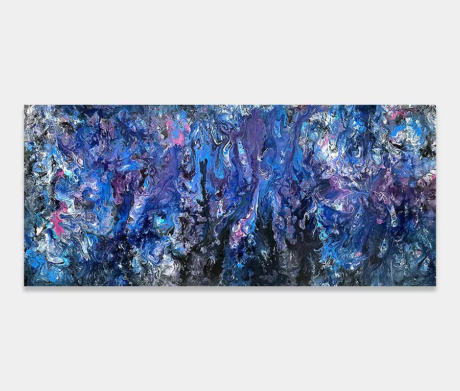
 Absolute Zero