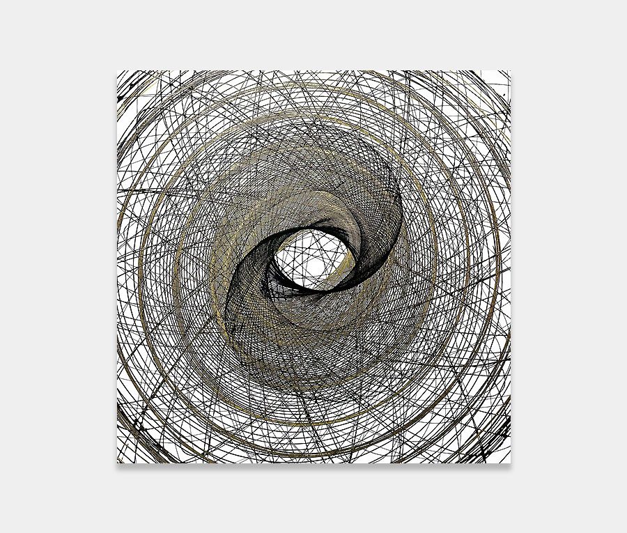
A large black and white abstract painting with gold and cream accents
A big canvas and my favourite colour palette are the only two things I really need to feel happy. And when that happens the best of me comes flooding out.
A big canvas and my favourite colour palette are the only two things I really need to feel happy. And when that happens the best of me comes flooding out.


This large black and white abstract painting is borne from the things I love about my craft. At the very heart of my love for this kind of painting is its size.
You cannot fail to be enveloped by it when you’re standing next to it. I love working with large canvas paintings as it allows me greater freedom than being constrained on smaller ones.
To that end I am able to tell a bigger and more dramatic story. And I think if you’re going to spend a significant amount of money on something you want it to give back to you for a long, long time.
Using a fundamental colour scheme like this one often requires something to bridge the gap between black and white. In this instance I’ve opted to use grey.
In the right tone and right quantity it can help ease the finality of the black whilst calming the harshness of the white. Grey is what I refer to as a mid-point tone – something that steals the highs and lows from the more rampant colours and evens everything out. It’s a reason why it’s so popular with those wishing to redecorate or re-design an interior space.
And it doesn’t matter whether you live in a contemporary penthouse apartment or a renovated Victorian townhouse – grey can be used to stabilize the most potent of extremes. It’s a great leveler.
In Newspaper Castles grey is primarily used as a bridging tone between the complex structures that form the painting. Most of these are either light or dark so introducing a halfway point eases the impact of the painting on your eyes. It’s a neat little trick that a lot of artists use.

From thick blocks of black paint to whisp-like fronds of gold, this painting is a real mixture of extremes. Blending techniques became obsessive as I strived to force paint into unique shapes – one after the other after the other.
I’ve watched rivers of metallic gold flow one way then the other, dispensed paint from syringes, thinned using pipettes and used a heat gun to artificially accelerate the skinning phase. This unusual mixture of techniques lies at the heart of the blended forms and shapes.
I can’t really say why I wanted to do Newspaper Castles except that I haven’t really done anything like it before. I have done the whole ‘flowing rivers’ thing but never on this scale and not with this depth of tone so I guess I wanted to see where the basic principles took me.
My focus group have all said they see faces in the painting.
I can see what they mean I think? There are definitely a few shapes that can be made out to be a face if you look hard enough. I like that – that we can see different things depending on who we are. I keep banging on a about how good abstract paintings can involve you on many different levels – remember that when you next go to a contemporary art gallery. Look for the depth; look for the story.
Not difficult.
A big wall, lots of space, a neutral colour scheme and big wad of cash. Don’t dilly-dally now, life is too short.

 Cluster One