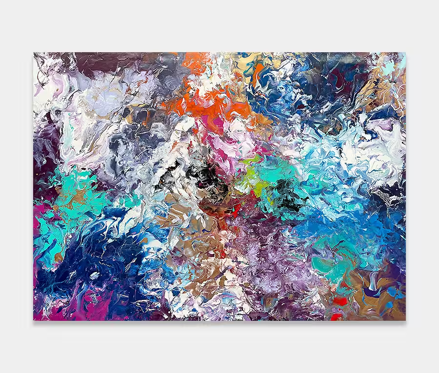
A medium-sized, mutli-coloured original abstract artwork
Sometimes it’s hard to put labels on things. And with art it’s incredibly difficult.
Maybe it’s just good to let something be, without the need to put it in a box.
That’s my reasoning behind this painting. To let it go and never look back.


I’m always a person who does their best to move forwards. By that I mean the things we choose to do and the people we choose to do it with. Whether it’s in my personal life or my art career I like to think of new ways to do things, new experiences to be part of and new ways to do good by the people I care for the most.
I believe that this is a vein of humanity that I have had from the start. In fact I think we are all probably built the same way. We can often get stopped or setback by other people’s actions or by our own making but that only means that we need the right opportunities to be able to go forward again. And I think in some way or another we all think like this; it’s what keeps us going forward.
I seem to have adopted this principle with my creativity. I can go and paint for a month or two then I stop. Frozen, full of doubt and plagued by self-deprecating ideals. But I find a way to get through it and push froward again. Maybe I need space for my head to make sense of what I’ve been doing or perhaps it is for reasons I don’t understand. Whatever the explanation it’s those precious few sessions after a recess that give way to the most dynamic and forthright of my paintings.
This is the premise under which Never Look Back was created; at the beginning of a new and refreshed period of creating, born out of a testing time for me where the entire world got put into question. What came out was unlike anything I had ever painted before.
I’ve got new mixing methods and a new chemical splitting agent to play around with. I’ve had huge fun creating the dragons scales effects (that’s just how I see it) along with a new blending out technique that can be seen in two opposing places around the edges. This is essentially a thinning procedure whereby I am ‘pooling-out’ a compound from one part of the canvas to another – the effect of which is to gradually turn the paint from dense into light. It’s a bit like having a pastel shade of my trusty enamels but with less paint involved. It sounds more complex than it is!
The main bulk of the painting is made up of a multitude of colours from across the spectrum. All carefully applied with needles and syringes to get the dramatic effects you can see in some of the close up photos below. It’s also a more sensible size too (compared to many of my larger paintings) so its ability to hang in your home is greatly increased as it’s not too large to cope with. Having said that, whatever it lacks in physical size it more than makes up for in its impact.
One particular highlight is the use of my specially made metallic blue. It’s in almost every part of the painting and it joins the pieces of the painting together. I’m very proud of that colour as I have developed it with my paint manufacturer. It’s bloody gorgeous – especially if you get it bathed in natural light. I also like the way that light changes as you walk around the piece; in areas the paint is thicker than others so you get a dimensional aspect to it simply by moving slightly from one side to the other. It’s also very glossy too and does reflect from the surfaces around it.
And light is one thing this painting absolutely needs. It is dark in places and despite the white spaces that remain around the outside it does need to be lit. A single spotlight for night time is fine but a strong source of natural light is really what this needs to get the best out of it.
")
")
")
")
")