Mind the Gap

Pink and blue art on a wall

A pink and blue abstract art work with hints of orange and gold

To say this is just blue and pink would be missing the point; let’s not forget the subtle additions of lilac, black, purple and burgundy. What a divine combination!
180cm x 90cm (71″ x 35″)

SOLD

Lines of blue and pink paints
Lilac and pink based abstract painting
Bright red enamel paints

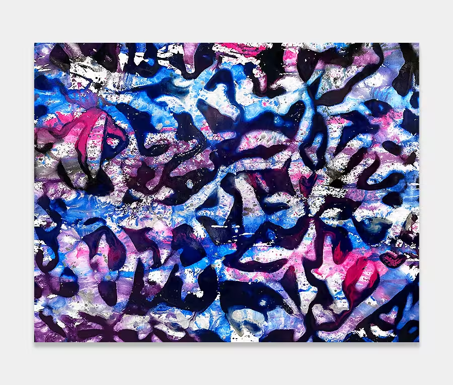
Combining the whole pink and blue thing

When I’m painting these pink and blue abstract art works I tend to begin with the secondary colours first. It’s important to have a supporting cast of paints to help the stars of the show shine. In this instance that’s a definite reference to the pink and blue.

I normally organise things the other way round but for Mind the Gap I had to figure out the other colours before I could work out how to arrange them all. Too much in the wrong place and it’s game over rather quickly. These matters have to be planned as best as I can beforehand.
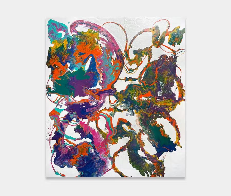
Shape creation

You can’t ignore the shapes I’ve painted on this canvas. There’s something very satisfying about laying down these rivers and swooshes of paint (my own technical terminology!).

To get a good contrast for the main applications of paint I made sure that the background layer was a graded lilac and pink affair – fused with a little white and purple for good measure. It’s important to have a strong foundation to work upon. Furthermore, the white was graded in the centre so that the colours have room to breathe as your eye gazes over it. White is such a good colour for creating break points.

Easy does it

Onto this lilac and pink layer I’ve used a pouring method to get the paints applied; paying careful attention to the accent colours of bright red and metallic gold. As these don’t feature highly it’s critical they are used in exactly the right amounts otherwise you’ll either miss them (not enough) or they’ll punch you in the face (too much). It’s always a fine line between success and failure.

Personally I like the burgundy best – it has such a contrast to the pink but without it taking over. I love this colour and think it’s very underrated.

Pink and blue abstract art called Mind the Gap

Paint effects

Goodness me where do I start?

I guess the most noticeable thing is the actual river flows themselves. I like pushing and pulling my paints into weird and wonderful shapes. On to this go the chemical additives to change the behaviours of the paint to my choosing. I’ve included splits, bubbles, separations, drops, twists, fades and blends.

Additionally, I’ve dissolved some of the paint rivers whilst in others I have kept their line structure as they were poured. Added to this is my playful use of gloss and semi-gloss finishes and some rather gorgeous metallic gold (which actually contains real 18ct gold powder); looks amazing when the light hits it.

Living with the colours

I think that if you’re looking for an original painting and a pink and blue abstract art work is not something you’d considered before then you may just be surprised with how easy it could be to live with.

On their own the colour combination is always going to suggest a children’s nursery or bedroom but when combined with the right accents to support them they transform into something really rather wonderful. Bold, charismatic and mature; that’s how I would conclude the feel of the painting.

Free home viewing

You pick the art, we bring the gallery.
That’s right, you can stay at home, sit on the sofa and let the art come to you.
Pick as many as you want to see and only pay if you decide to buy.

Company No: 8427039 | © Swarez Modern Art Ltd 2024 | All rights reserved