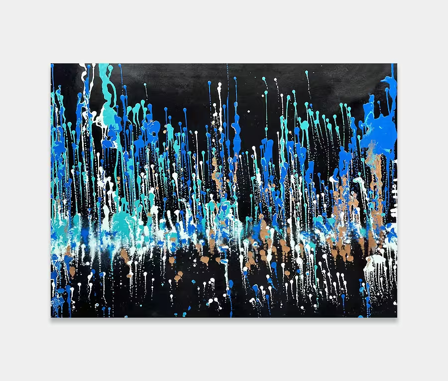
A medium sized piece of black and grey abstract art
It’s good to get a little dark and moody now and again. I like the contrast between light and dark and the power it creates.
140cm x 75cm (52″ x 31″)
It’s good to get a little dark and moody now and again. I like the contrast between light and dark and the power it creates.
140cm x 75cm (52″ x 31″)

")
")
As dramatic and final as these two colours are it’s very easy to find yourself creating a monotone and depressing piece that no-one will ever want to hang in their home.
So these two tones have to be used carefully and with a degree of measure and restraint. Or you can just go nuts of course. I prefer the second option myself. I don’t do convention and I don’t care for rules.
Why? Because I love the colours for starters. Secondly because I also love gold and cream so putting all these together is never something I shy away from. 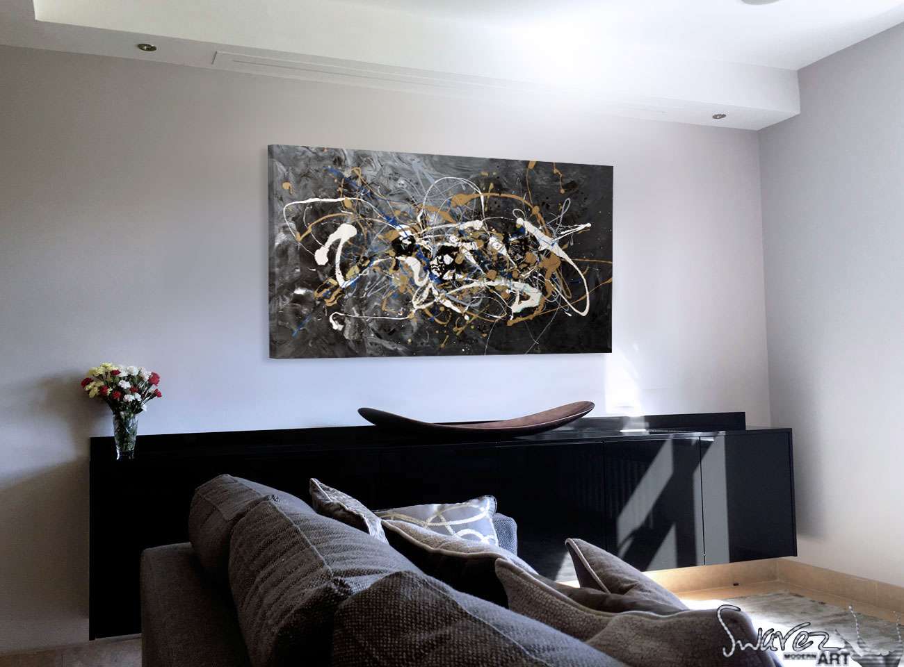
However, using such a dense black as the backdrop to what caries on in front of it is a little left-field – even for me. As mentioned previously black is a very final kind of colour. You can destroy almost everything with it if you don’t know what you’re doing. I still get it wrong on a regular basis.
And how? Well, the base layer is a fusion of silver, black and grey. The foreground colours of blue, teal, white, cream and copper (and gold) are all applied with a wooden spoon. I have chosen to leave some bits for longer periods than others as I need some of the applications to skin over before continuing (whereas with some of them I haven’t). This helps define the line structures.

These are two wonderful colours. Mine are mixed with quite a small powder so they both share similar refractive qualities. The copper tones help add warmth to the painting (a much needed addition to what could become a very cold and isolated piece).
The gold is really just there to add a bit of bling.
I don’t see this painting as heavy or dark – I see it as solid and robust on one hand and playful on the other. Wherever I have hung it I have seen the space gain a degree of authority and maturity and also, dare I say, a little opulence? These are very regal colours in my mind so I would imagine that’s why I think of it as being a bit decadent and wanton.
Sure beats staring at print of a girl with a red balloon (actually I am a big Banksy fan but you get my point).
You don’t need a huge wall or a massive budget to enjoy Wavey Davey. You need a light coloured wall and a little bit of natural light. Hang either way – it looks great from all orientations to be honest. Oh and don’t worry about interior color schemes either – you don’t need one; this will go with anything!

 The Delicate Sound of Thunder