")
A medium sized contemporary artwork with black and orange loops
Poised, balanced and deceptively carefree; three qualities that describe this original painting beautifully.
It reminds me of kites flying on a breezy, sunny day.
")
")
")
")
")
")
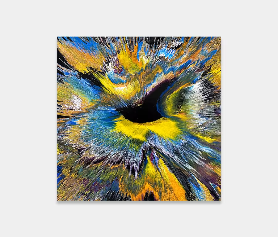
Black and orange are a classic colour combination. Too much and the result is overbearing; too little and you barely notice them.
Get it right and you get all the pizazz and splendour of the rich, deep tones without the heaviness or overkill. In this painting I chose to be very selective about where I placed the swoops and in what quantities I placed them in.
It’s important to give these colours a solid foundation on which to work which is why I chose silver for the background. Not only does it show off the shades on top but it’s also a very mature and reassuring colour.
After all the feathering and blending of the underpinned arcs I was able to have some fun with the top sweeps that make up the majority of the fluid lines in this piece. In some areas I let them run into each other and in others I stopped it. This is another reason why this panting holds your attention; it’s in the detailed decisions that went into how and where I used the paints.
If you can let your eye follow some of the routes around the surface you can find yourself in a whole new world. I’ve also been extremely careful with how weighted the applications are. By this I mean the volumes of paint contained within the the line shapes.
This was always in my head as a very flowing painting rather than one whose composition is dominated by the heaviness of a couple of densely applied shapes. Like the area in New York called Manhattan (from where it takes its name) it’s sophisticated with some surprising twists and turns. Sums up my experiences perfectly then!