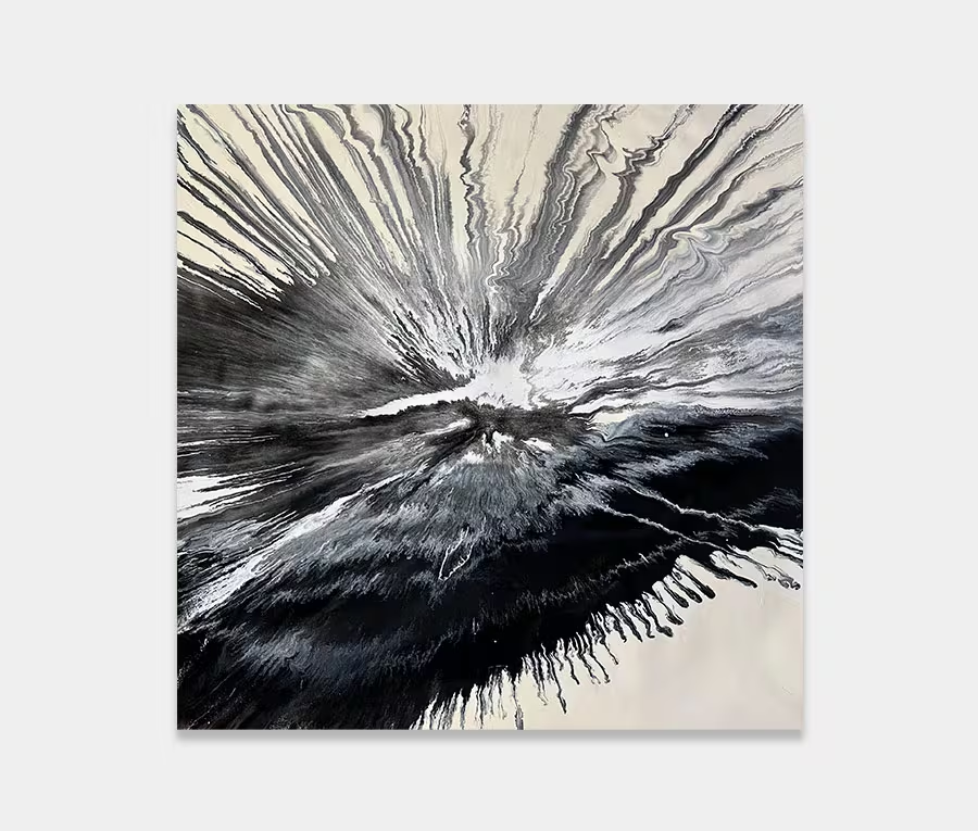
A large black and white abstract art work with blue and gold highlights
I love black and white and use them wherever I can. I think of this as being utterly mad, but in a controlled and uplifting way.


")


Pushing the whole light and dark thing
This large black and white abstract art work is a little bit different to the things I normally create. It’s not to do with the materials I’ve used but instead it’s about the way I have used them.
I am not prone to such stark contrasts between light and dark to be honest, even though these elements usually feature somewhere in my work, so in Lost For Words I thought I’d make these opposites a little more extreme. Black and white is the best combination to express light and dark.
Carefree actually requires a plan
The result of this is an abstract painting that is has absolutely no regard for conformity. The only rule I have stuck to is that of containing the whole composition inside a generous white border. I’ve pretty much gone bananas everywhere else.
That doesn’t mean it’s slapped together with a blatant disregard though; quite the opposite in fact. The flows are balanced, the addition of blue and gold is very carefully considered and the concentration of detail playfully cascades through the centre of the painting – leaving the madness to surround it.
I have to have a plan in my head otherwise it turns to shit very quickly. The skill, I guess, is taking a series of planned moves and applications and making them look like they never existed in the first place. If that looks like the case then I’ve succeeded.
Paint effects
There’s a number of unusual techniques at work here. I’m a big lover of organic flows and rivers so it’s no surprise to find a wealth of them on the canvas along with all manner of additional paint applications that have been spooned on, poured on, spattered, maneuvered, smacked, syringed and thrown.
Perhaps my favourite paint effect is the separation of the gold metallic flakes. The version I’ve used here contains a very fine powder so splitting it within the resin (that it’s suspended in) is a real achievement and not something I can be too precise about; it relies on a chemical cocktail to alter the drying state of the resin. I’m really pleased with it though, even if it exists on a very small scale.
Placing the painting
It’s a very easy shape to live with so locating this is easy. It’s quite long though so you’ll need at least 3 – 3-.5m of width across any wall space as a starting point. Black and white is a pretty universal colour scheme but it’s the additions of blue and aqua that may require a little freshness to be added around it. I would suggest some slate greys and maybe a little chrome or stainless steel.
It’s quite a bold art work though and I think you’ll need to have a desire to really mix things up to get on with it. There’s no ignoring an artwork like this and as a result it will always be present in the space it hangs in, but that’s a good thing isn’t it? It reminds you that life is short and that you should really just go for it sometimes and let your heart rule your head (and wallet!).