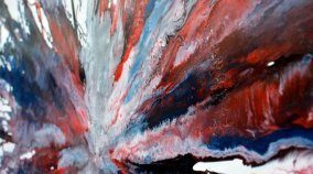
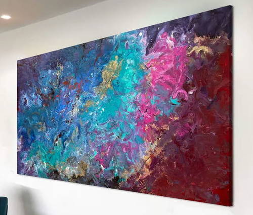
A stunning red, white and blue original painting
It could be that this is very patriotic (depending on where you live), or you can choose to just lose yourself in the explosion of colour and movement.
Hope and Glory
The title of this new contemporary painting is an evocative one. For some it will stir something patriotic but for others it may symbolize something that all of us share as humans. Hope.
I have always thought of this emotion as something that starts very close to your body and radiates outwards in all directions. The further you can send it out the more good it does. This is why the painting comes from the centre; the most personal thing in all of us. It’s the bit at the very core of who we are.
Unusual techniques
I’m always searching for new ways to do things. Much of this necessity is borne out of curiosity but it’s also generated by need. In Hope and Glory, and indeed a number of other similar paintings I’ve been working on recently, I had to come up with a solution for getting the paint to flow to the edges of the canvas whilst still maintaining a degree of balance.
It’s been a nightmare if I’m honest, mainly because I paint flat on the floor. This means that I need to lift the canvas in order to get the paint to flow. I can’t apply with long poles or stick because it looks rubbish and I’ve tried using all kinds of tools. So I had to put everything in the middle and gradually work it all outwards, there simply wasn’t any other way to do it.
Adrian (my colleague) eventually made me a bizarre contraption 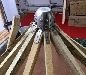 made out of 12 wooden poles and a stainless steel cup. It looks like an octopus has had sex with a tree and this is what came out.
Paint effects and finishes
This painting has some usual paint finishes. In some of the photos you can see some crazing underneath the paint. It’s a neat, if random, little trick that is created by shortening the time between layers.
Essentially I can play around with this to bring out some of the underlying layers and feature them as raised points through to the top. It’s caused by the solvents curing through a layer of paint over the top instead of being allowed to evaporate into the air.
There’s also a mixture of matt and semi-gloss finishes too plus loads of tiny little lines and ripples of paint that seem to have developed their own sense of purpose.
Living with this kind of painting
What’s surprising is how well this looks on a grey wall. Furthermore it’s also very at home on almost any kid of off-white or marginally toned wall colour. It’s going to need some space around it but can quite happily sit in a dining room as well as a hallway or stairwell.
If your living space has a large empty wall then think how this could energise your surroundings? I see many variations of red and blue on my travels as these two colours work very well with a range of others so fitting this in really shouldn’t be a problem.


