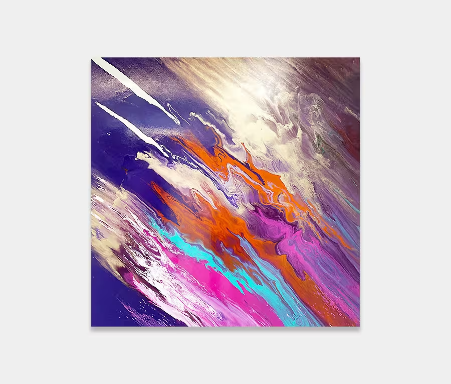
A layered contemporary painting featuring pink, purple and black colours
Here I go with the whole purple thing again…
This time I’ve gone for more rigid lines underneath opposed by a carefree breath of fresh air over the top.
")
")
")
")
I now know that the name of this contemporary painting is also a song by James Bay. I appreciate I may not have my finger on the pulse of new music, but it seems I have been living under a stone for sometime as I came up with the name a while ago, and without knowledge of this very talented singer/songwriter. Anyway, I’m glad the name does the painting justice and am thankful it fits so well.
One of the most apparent benefits of being in my latest paint studio is the rekindled desire to try new things. I had become rather frustrated and disillusioned with the old place, mainly because it was dark, cold and flooded every time it rained. Add the lack of light and power to the equation and it made for some pretty oppressive paint sessions. But that was all I could get for 18 months. Funny what we allow ourselves to put up with isn’t it?
It’s a different story now though and after a few short weeks of experiments I have begun to regain that pioneering spirit and feel excited about my painting sessions again. To that end this is the very first finished piece to come out of the new studio and one I am immensely happy with.
The layering of paint in this piece gently ebbs and flows and falls away in the most unexpected of places to reveal more colour and texture underneath. It’s tonal ranges go from dark to light and its ability to bounce off light is unlike anything I have created before.
The reddish-purple is a slightly new paint mix and features a brand new drying compound in it. Not fussed about the technical things? I hear that. So I’ll simply say that it has the effect of accelerating the cure time for the gloss part of the paint. It has produced, in my opinion, a deeper and more intense colour. I’m sure a chemist would offer up a different explanation but all I care about is what it looks like. And it look beautiful.
It’s a different story when we reach the black though. This is a far less glossy finish and, as a central focus, is one that has the ability to attract and repel in equal measures. Maybe it feels like a tidal surge or a movement of water perhaps? The black is also tempered by some carefree drops and splashes that I have then worked into the black by means of chemical splitting. Mind you, it’s only on certain bits though as I wanted some of them to blend in whilst others to stand out. I wish it was as easy as throwing it around and hoping for the best.
And whilst we are on the subject of the middle part of the painting I would like to mention the tiny droplets of red. I think there’s just enough for the painting to have that little bit of an edge without it losing some of its tranquility. I think of it as a suggestion of colour – something to make you look twice perhaps?
And so we finish on the opposite side with a very serene mauve and a deep stone colour. This particular version is one of my favourite neutral tones, not too bland to become insignificant but not too loud to become dominant. For me it’s the bit that tempers the purples around it. It’s good to keep one foot on the ground sometimes.
If you have a grey wall somewhere then maybe you should consider adding something purple as a way to bring it alive. Two colour combinations that work brilliantly together.