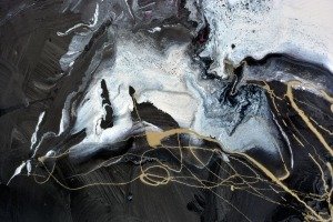
The use of red and gold
The main focus of this abstract painting is the central white shape. It’s made up of cream and white and has a small seem of gold running alongside it. The gold is a natural light reflector so it adds a beautiful shining element to the piece.
The addition of the reddish pink colour you can see woven into the central element lifts the painting into a warmer place and one that’s not quite so sharp and distant.
Trust me, when you’ve got a piece of art like this on your wall the last thing you want is for it to repel you every time you walk past it – the use of gold and red is the key element in breaking down the barriers of distance. Ultimately these two colours help you engage fully with the painting.
Conclusion
You can live with the power and drama of this painting because it’s very easy on the eye. Sure, it’s dark and it definitely sucks you in but that’s a good thing. It will remind you that you have a pulse each time you walk past it.
And for those of you that care about your interior Feng Shui (I count myself as one!) then rest assured it will not only fill any feature wall magnificently but its predominantly neutral colour palette will look amazing with stone, slate, steel and wood finishes and just about any combination of colours you may have.