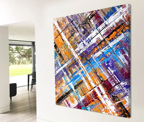
A large blue and gold abstract painting with hints of orange and yellow
So the name came after the painting and although I have no ocean-inspired references attached it seems perfectly fitting to give it one now.
So the name came after the painting and although I have no ocean-inspired references attached it seems perfectly fitting to give it one now.


is a venture in to the unknown for me. On one hand the materials and colours are all familiar but on the other the application methods are anything but.
Instead of my normal array of tools I opted to use only one – a syringe. Yes, that’s right, a syringe. And just the one. Every ounce of paint has been sucked up and applied using a single syringe in just two sessions (the average is around 6).
The biggest challenge was to get get the gold to form an even layer. A little chemical wizardry and some mineral thinning agents definitely helped.
The painting has also given me a number of other challenges too – mostly that was down to the swathe of turquoise, white and aqua that runs through the centre. In fact it started out as a single white swoosh and nothing else. However, because I cannot resist messing around (with things that look perfectly good) I started to add other colours and effects to see what would happen.
A painting can be won or lost with the most delicate of applications. A little too much colour or an incorrect viscosity and you can lose it for good. This was the case with the middle swoosh. In fact I lost it and won it on more than one occasion.
Normally when this happens it turns to crap. In this instance though I somehow saved it and produced a beautifully formed and well balanced focal point.

From that point it was evident that it needed a proper splash of colour. Orange and blue are a combination I really like and they always remind me of summer holidays by the sea for some reason.
Anyway, a much needed splash of orange has been delicately positioned rising up through the centre whilst another dances precariously along one edge.
Married to this is an adjoining sunset yellow; it’s one of my favorite colours and I considered adding this for ages during the final session. Eventually it went on and I’m relieved I listened to my gut feeling. It’s kind of a half-way house between the opulence of the metallic gold and the outrageousness of the orange.
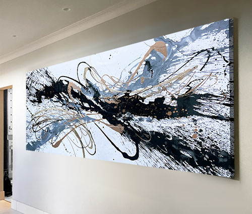
An office corridor, almost any living room and certainly dining rooms and open plan areas could handle Full Speed Ahead.
The shape is easy to look at from a distance as well as endlessly engaging as you stand right next to it. The black is the tone that grounds everything and the richness of the gold will anchor all the natural tones you may have. If you consider it from a design perspective then all the boxes get ticked.
However, to do that on its own is to miss the point. Your art choices should be led by your desire to want it, not the features of your interior space. But let’s be realistic too – you gotta stare at it every day. So it has to be right on ALL fronts.
In my own opinion a good abstract should engage first and foremost. It should have enough to keep you interested but not overpower you, it should feel calm when you need reassuring, scream when you feel confident and be something you’ll want to look at every day.
If it doesn’t, move on to the next one. That’s all there is to it.
When the voice inside your head says ‘wow!’ listen to it. If it doesn’t… well, you know that bit already.
And don’t let anyone tell you otherwise because they’ll be some kind of manipulative art ponse trying to make you to part with your money.
Curse these people!

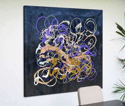
 A Long Way From Brooklyn