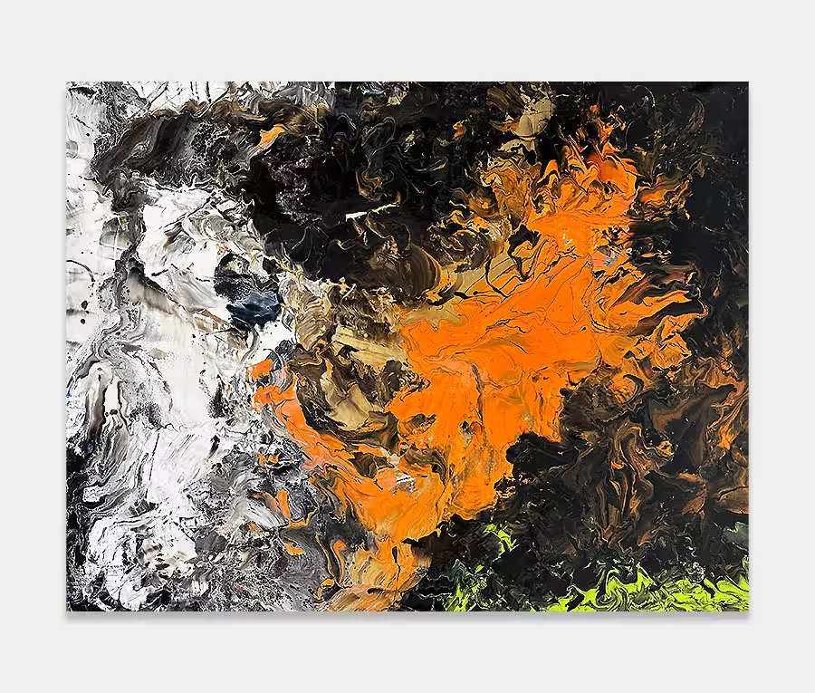
‘Terminal Velocity’
is a rectangular modern artwork featuring light grey, gold and black coloured paints
225cm x 95cm (89″ x 37″)
225cm x 95cm (89″ x 37″)


Grey is not always an easy colour to work with. Sometimes it can wash away all your hard work in a heartbeat and at other times it can turn a painting into a depressing and dreary shadow of its former self.
Artists will use and interpret this colour in an infinite number of ways but for me I either use it as an addition to a background or I absolutely go for it and make it the backbone of an entire composition. And that’s what Terminal Velocity is all about. The power of grey.
Don’t think for a moment though that it means boredom or the mundane. Skillful use of complimentary colours plus a well-thought out sequence of shapes turns a potentially awful thought into something rather wonderful.
So my basic outline of using three shades of grey (definitely not 50!) needed an injection of mystery and intrigue to get you interested. The key consideration here was the use of black.
I never considered using it for anything heavy as that would have detracted from the subtlety of the grey tones; instead I have used it for two purposes. Firstly to bring a little gravity to the painting (and give it some weight) and secondly to give your eyes a natural starting point.
The great thing about contrasting tones is that you notice them without thought. We process light and dark instinctively which is part of the success of this painting. Chances are you see the black on the left of centre first then move to the right and grab the dark grey. After that your brain will most likely circulate around the rest of it and then process that information to give you an emotional response. Our brains are amazing.

Anyway, the structure is one of repeating up and down and left and right movements. I worked paint in both directions, and from all sides, of the canvas to get this effect. Mostly this involved dragging carefully placed amounts of paint and spreading them one way then the other until I reached the desired look.
It’s not rocket science but is remarkably involved; especially true when it doesn’t go how you planned. It’s these problems that mark the success or failure of a painting for me – they rarely fall from my hands perfectly first time round. This is a relatively untested technique but I think I’ve cracked it finally.
I am a firm believer in attention to detail. Not only in terms of the quality of work I create but also the attention that goes into even the most basic of paint strokes.
I am rarely content with taking the easy route so I like to get as many fine details into my work as I can. In this painting they’re in abundance even if that’s not instantly noticeable. On Terminal Velocity I used needles and syringes and a series of chemicals to get the peppered look and moved on to some other weird and wonderful tools to do the rest.
I’ve shown a couple of examples of how this painting will look in a room setting. To be honest I think you’ll either need something in your space that’s either black or white to bring the painting alive. It’s not going to work too well in a brightly coloured space. You really do need some neutrals and some black and white for this to get noticed.
Fortunately though if you have grey already (slate tiles or maybe a grey sofa?) then this is going to look pretty good in my opinion. It also looks great with wood thanks to the generous and rich metallic gold. If you have a mixture of these materials and finishes you’re in great shape.
It’s not too shouty and not too garish but has all the drama you want from an original modern artwork. Its power is in the shape and it’s restraint is in the colour. If you want to accent feel free to use gold and silver or anything copper and bronze.
So you can see that if you use grey wisely, and with a series of complimenting tones and shapes, it can be something rather special.

 Bound for Glory