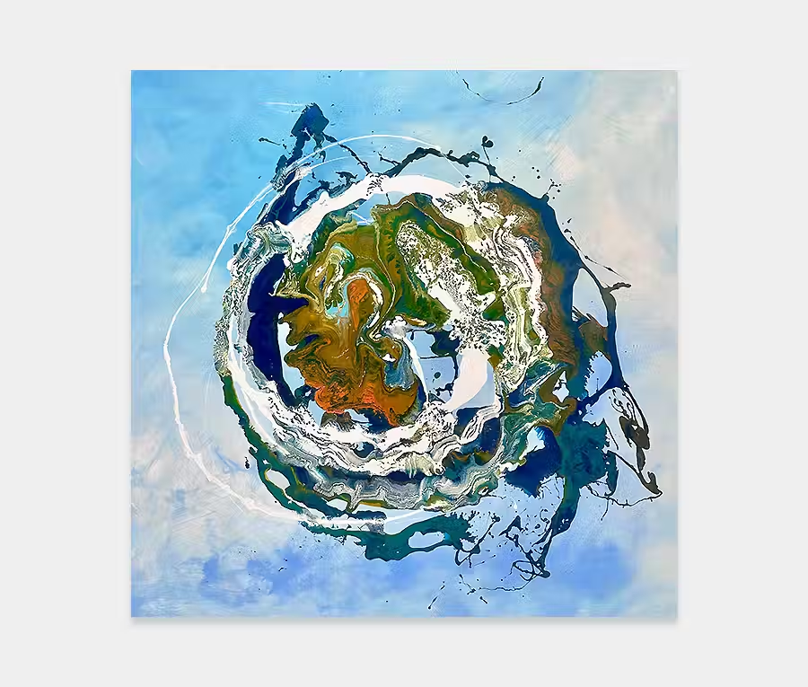
I don’t often do smaller sized canvases and certainly not small blue paintings. It’s mainly because I find it difficult to move and shape paint on a smaller scale. Most of the applications techniques I use need a large surface area to fully extol their virtues. However, occasionally I break off from the normal sizes and create with smaller walls in mind. In many ways it’s a bigger challenge as I have to get the impact of the larger pieces across in a smaller one. So choosing colour and shape is more important that ever. I just don’t want some lop-sided afterthought that’s ill-conceived and full of mush.
So armed with a palette of colour and an idea about what to do with it I set about forming a linear and structured composition. As I’m having a lot of fun with blue at the moment it’s a given that this colour should be prevalent on most parts of the painting. On their own the three metallic shades (Ice Blue, Water Blue and Swarez Blue) would be alright but it’s not going to really give me what I’m looking for. So in comes orange, purple, white and yellow.
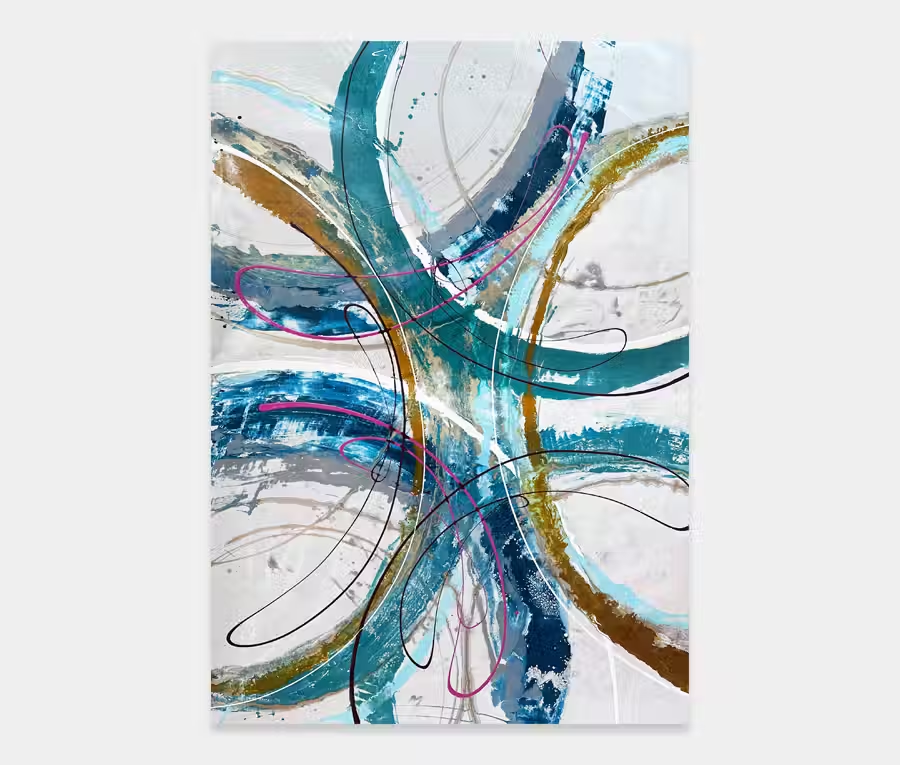
And that’s where the paintings really begins to find its feet.
It’s worth pointing out that, as an artist, it’s very easy to go overboard when you find your groove so using restraint and moderation are important considerations to a good piece of art. It doesn’t mean it has any less personality it just means it becomes more mature an considered in its finished format. And I genuinely believe that you can spot that whether you know anything about art or not. Quality is always evident, as is the lack of it.
I take time with my materials and even more with the composition. It’s this attentiveness and courtesy to the paint that lets me evolve my work into new and developing styles. And although I have painted in blue, and in lines, before I have never quite manged to pull off a painting like this until now.
My sheer delight at what you see on this page is borne out of peace. A series of quiet and reflective sessions that were fueled by nothing other than the love of what I do. Those times are rare so I take them when I can. The blues are relaxed and flowing; the highlighted colours are daring yet controlled. The detailing levels are all still there too – even though it’s a lot smaller than normal. And I have paid extra special attention to the size and shape of the line structures so that they fill up but don’t overpower.
So it’s just about got it all for me. And whether or not you’re not a fan of repeating linear shapes, in my eyes this painting is a real gem.
")