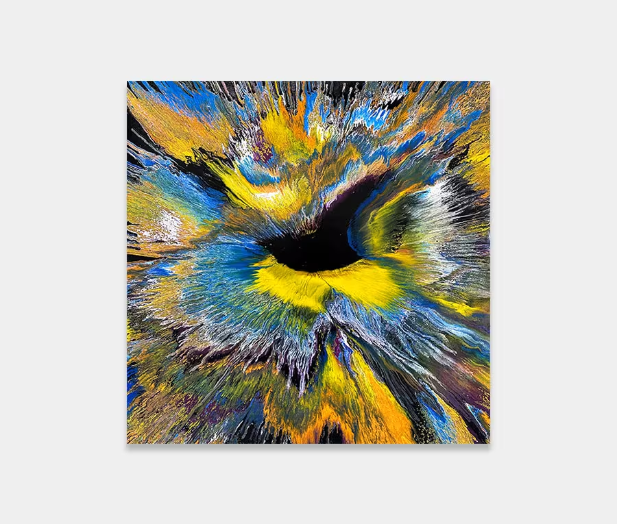
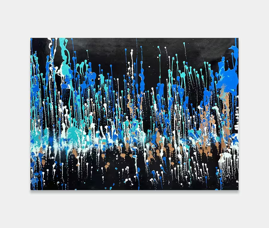
It’s not very often I abandon my normal celebration of colour and try something like this. I may have only used this simple combination twice before in all the years I’ve been painting (once with Ramesses and once with The Quark Entanglement). Yet, despite the relatively simple colour choices it’s a remarkably involved and complicated piece of art.
So let me tell you about the colours first: we have a stock white and cream and a very light mushroom. This is essentially the formation colours for the background layers. On to that I have a stock black and the slightest hint of turquoise. For warmth there’s a splattering of metallic gold too. Now, simple solid shapes of black would do just fine but I wanted something a bit more elemental – perhaps more skeletal in form. I think what I’m attempting to do is strip back all the fluff and apple pie and show you what’s really going on underneath. I wanted to achieve something very organic – like cell growth or tiny sea organisms.
It’s this very principle of stripping away all the crap, to reveal the beauty that lies beneath, that’s the real story behind this black and white artwork. I’ve been so careful with my applicator to place only the smallest amounts of paint at any one time; I need to leave room, and time, to manipulate each strand and loop so that I can modify their structures before they begin to skin over. It’s a particular problem with very thin layers of paint – the short amount of work time you get before they can’t be moved any longer. I’ve had a huge amount of satisfaction in playing around with different shapes for the movements – twist and turns and splats and drops – I think they’re all pretty much in there somewhere.
It is perhaps, though, the added 100 micron metallic colour-changing powder that really sets this painting apart. You definitely have to move around it to catch it but standing face on will reveal nothing (neat huh?). So what I’ve done here is to apply the powder at selected places across the canvas to highlight particular areas. As it’s a light refractive powder it will only irridess at certain light wavelengths; this means you’ll get sparkles when you least expect it (that’s the only way I can actually describe the effect). It’s not blatant and not in the slightest bit blingy or kitsch – it’s restrained perfectly and only catches your attention when it needs to. It would have been silly to overdo this effect and spoil the drama of what’s going on underneath.
I really like the delicacy and fragility of this painting; it’s not too fierce and not too bold. There’s just about enough of everything, and in the right proportion, to get the message and feeling across without the need to go completely mad.
I think it’s rather beautiful actually.


")
")