")
")
")

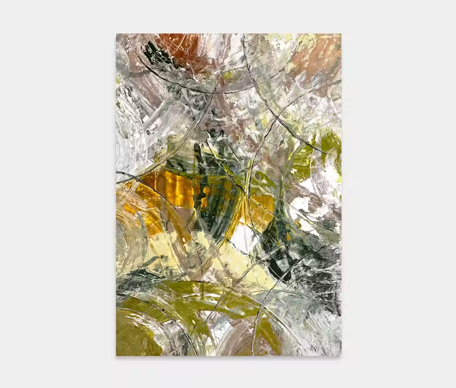
Dawn on Pompeii
£4000
RSERVED
180cm x 140cm (71″ x 55″)
includes UK delivery and hanging
(Worldwide shipping available)
There’s something quite grounding about using a series of earthy, natural tones when I paint. I think it’s hard to escape thoughts of nature when you delve into the colour palette that defines the living world around us.
With Dawn on Pompeii I used a combination of orange, black, copper and green with a dahs of white thrown in to help lighten things up. The result is a painting that feels warm and reassuring whilst also being exciting and dramatic.
Oh that orange!
These emotions are mainly centred around the big swathe of orange that dominates the entire piece. It’s sharp angles and changes of direction feel mountainous and capacious to me as well as reminding me of fires burning wildly.
This is thankfully tempered by the calming nature of the lighter tones built around it. A mixture of white, copper and black cool down this fiery centrepiece to create areas of relaxation and yet are still packed solid full of details and interesting nuances.
Finally we have the small slither of green making an appearance from one side. It’s a gentle and subtle reminder of all living things and feels exactly right – never too shouty but just enough.
Great name right?
I had the name fixed for a while but never found the right painting to pair it with until now. I imagine how the city must have been looking during the eruption of Vesuvius on the morning of August the 24th 79AD and it’s always been a historical event that has fascinated me.
I’m a bit of a volcano nerd to be honest! Anyway, if you like drama and love orange then this could be the painting for you. Perfect behind a sofa or on a feature wall in your dining room. How’s that for a conversation piece over the main course then?