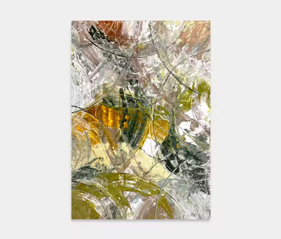
A black and gold art work with copper hints
Light an easy going on the outside; dramatic and powerful on the inside. If ever there was a painting of two halves then this is it.
180cm x 130cm (71″ x 51″)
Light an easy going on the outside; dramatic and powerful on the inside. If ever there was a painting of two halves then this is it.
180cm x 130cm (71″ x 51″)


 A few of my favourite things
This black and gold abstract art work is made from all those good things that have become synonymous with my craft; movement, attention to detail, textures, blending and that all-important contrast between light and dark.
It features a very carefully applied central application that contains black, gold and copper paints that sits in contrast with the stark white background on which it sits.
There is something very regal about these two colours. It’s both opulent and rich as well as aspirational and mature. From the ancient Egyptians to the present day the combination of day black and gold have come to symbolize wealth, power and status.
In this painting I have also added a metallic copper to add a little warmth and depth and also a couple of light grey tones to help balance out the light and dark elements.

The majority of the paint on this black and gold abstract art work was applied using a circular arm motion and the use of a plastic spreader. None of my application techniques are that fancy even if i do like to use tools and applicators that aren’t necessarily associated with painting.
I went for the combination of two main circles and then piled in the details inside them. If you see this in real life you may notice how these applications are fused in with the solid white base layer – this was achieved by literally doing the whole painting in one sitting.
The overall process was about 5 hours from the first brush strokes of the white background to the last few drops of black at the end. The only way to fuse everything into one layer is to make sure you complete everything before the white starts to skin over. With this particular blend of white the maximum time I have is around 6 hours before it’s too stiff to force paint through it.
Well, it’s minimal and contained but also bristling with life and beautifully executed. There’s just enough black to give it some balls and just enough gold to make it feel opulent and seductive.
The movements keep your eyes moving and the detailing exists on an almost microscopic level. It really does pretty much tick every box in my opinion; however, the beauty of Damage Control lies in its contrast between light and dark.
These two fundamentals of life play against each other magnificently. The balance is perfect, it has plenty of accents to liven it up and the use of some well chosen neutral colours show off the extremes even more.
Let this be as light or as dark as you want. And of course you can change your mind in a heartbeat about which side you land on. Marvellous!

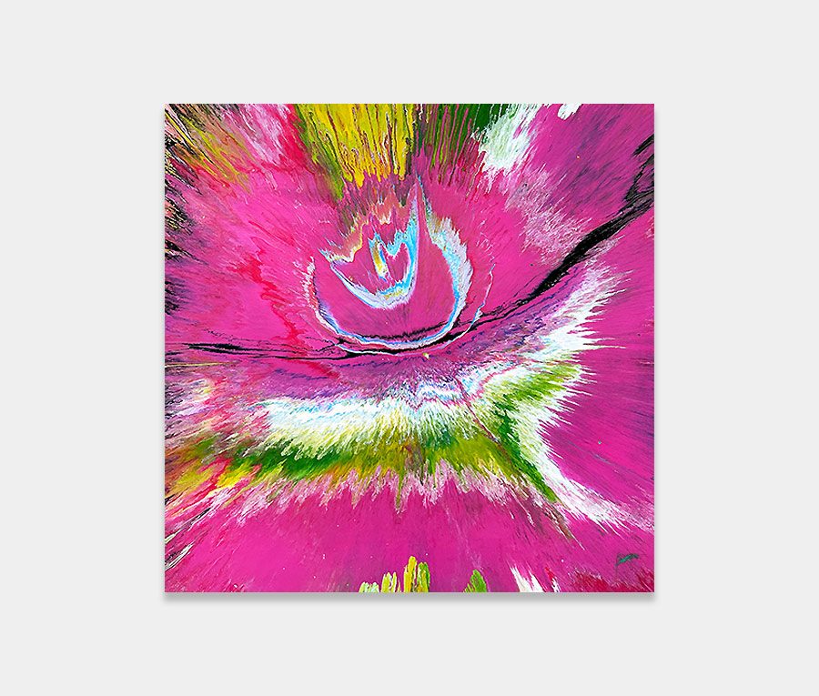
 Terraformer