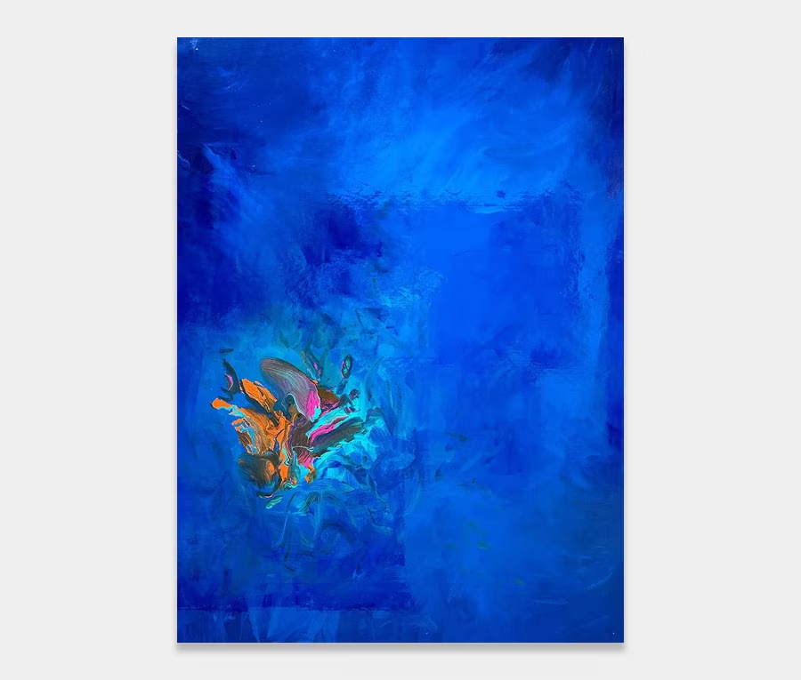
‘Cobalt Sunset’ is a large painting with gorgeous blue tones and linear shapes
Beautiful structure, calm colour and just enough drama to remind you that you’re still alive. 180cm x 130cm (71″ x 51″)
SOLD
Oceans and things
I have a sea thing going on at the moment – the desire to move to the coast and be near the ocean. It’s inevitable that these dreamy meanderings will lead to some kind of subconscious output at some time or another. So I make no apologies for the intense use of blue in this new painting.
And many there are too. In fact this new original artwork debuts two of my new metallics – ice blue and water blue – paints I have had specially blended over a period of four months (I’m bit obsessive over them). These two new blue themed paints are rather subtle but incredibly beautiful. One of the reasons for this is the quality of the metal powder I have put inside them. But let’s not go all technical for a change; let’s just enjoy them!
As blue as they come!
The inclusion of a number of blue tones is great but to really set them off I’ve gone for a selection of underpinnings in different colours and then very carefully let these show through. The net effect of this kind of application technique is to ‘layer up’ the painting so that it reveals its underside the more you look at it.
Now, there’s nothing wrong with smooth, single wave applications (that don’t contain any layering or depth) but there is something rather magical about revealing the hidden structures of a piece of art. I often think of it as being more involving and absorbing than staring at a flat surface.
Structures
So that brings us onto the shapes and structures that make up the painting. Let’s face it, colour is colour but it needs a context to exist in, otherwise it loses some of its beauty if it sits alone. So I’ve gone for a regular, linear application method that essentially utilizes a custom fabricated squeegee and a very long pole. Sounds simple right? I wish that was the case.
One of the biggest problems with this kind of layering technique is the need to explicitly control the pressure and rate at which the tool is moved. Anything too firm or too quick and it all comes off at the other end, anything too slow or too light and it coagulates into brown sludge. Like everything I try to master it essentially comes down to doing lots of practice and understanding how my materials work together.
Decision making
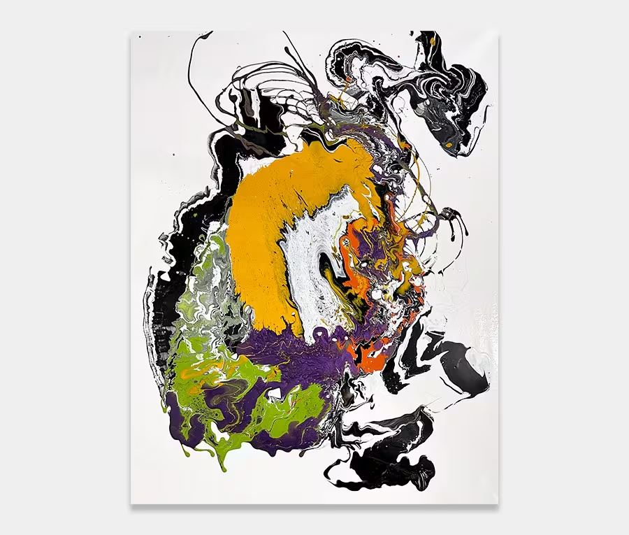
So whilst you could easily go make a tool to have a go for yourself it may take you a while until you can create the really important stuff – compositional layout, details, line structures, dark and light balance, colour dispersal, layering depth, curing rates -really, the list does go on and on. It’s only when I sit down to write about it do I realise what goes into each painting.
For example; consider the large orange area that has it’s balance in the yellow opposite it or the delicate striations of gold that get offset by the subtlety of a gentle sky blue beside it. I really do try to pack an enormous amount of detail into my work; I guess you just need time to live with one to really get the full experience. It’s the reason why I tend to have a back catalogue of work (that may have been created over a year ago) that’s only just making it onto the site – I enjoy learning about them in my own time first before I release them.
Anyway, back on Planet Earth, this painting has enough structure to satisfy our desires for order yet enough twists and turns to appeal to the carefree side we all have. Add to that the depth and range of these gorgeous metallic blues and what you get is an art work that satisfies on almost all levels. But that’s just my opinion of course…