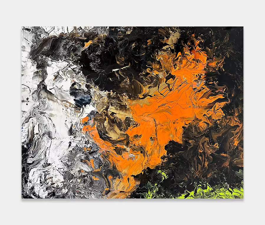
‘Telegraph Road’: an original slim-sized, brightly coloured painting
Is it me or is this brimming with happy things? I think it is.
Conceived and created after a very long spell of heavy rain and dark nights.
Proof that colour will return to even the darkest and dullest of days. Hallelujah!
Painting in bright colours
I love using bold colours and creating brightly coloured paintings. Don’t get me wrong though, I do love just about every colour combination you can think of but there’s something about combining all my favourite ones into the same painting that really excites me.
Creating balance
Multi-coloured paintings can be quite difficult to get right. Very often I find that using tones from most areas of the spectrum can take as serious amount of thought before opening a single can of paint. The reason for this is balance. If you start to overdo one particular colour you’re at risk of losing the others. And when that happens it’s no longer a joyous celebration of colour – it’s a single coloured artwork featuring bits of all the rest. So balance and ratios are critical in achieving something that communicates the magnificence of colour.
Composing and creating
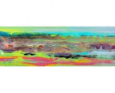
And so it is with Telegraph Road; a long, slim shaped painting that’s small enough to fit into most spaces but big enough to bring it alive. In composing the structure I was clear from the start that the movements would stretch from one side to the other. It’s a deliberate ploy to make the painting feel longer than it is. And it works brilliantly too.
In addition the choice of green going into a light aqua is also carefully thought out. In past attempts at paintings like these I have always struggled to place green; it can be a tricky colour if you’re composing an abstract (well for me anyway). So here I went for it as the base colour and then fed everything else into it. This was definitely the eureka moment. In fact I have demonstrated this on another slim painting called One Of These Days – a quick glance at that will show you exactly what I mean about using green as a base colour.
Adding the right accent colours
I’ve helped the bright lime green calm down by introducing a rich telemagenta pink and deep sunset yellow – it’s a kind of contrast to the other side where rich metallic blue resides. This painting is all about contrasts really; where there is dark it’s followed by light, where the colour blends with its neighbour it’s surrounded by drama. You can probably come up with your own name for this effect but for me the word ‘balance’ seems to fit rather well.
Stunning details
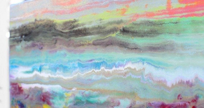
But the clean horizontal lines are only half the story because this art work is jam-packed full of beautiful and delicately subtle detailing. A quick look at the close-up photos will give you an insight into what I mean. The centre of the painting is much more diluted in its tonal range. I felt that if this became too stark it would cause you to miss some of the dramatic movements elsewhere. Sometimes I really have to rein myself back from going too far! It’s very easy to get this kind of thing wrong.
I needn’t have worried though as the overall balance between loud and quiet, and light and shade, is just about perfect. It’s nice to let your eyes caress the paint movements back and forth. It’s a very easy going painting and will never fight you or shout at you. I think there’s just about enough of everything in it without it going over the top.
What do you see in it?
I guess you could see rolling hills, the sea, a mountain range or any manner of natural references in it; but then again you may not. That’s the very cool thing about it – you own your own reactions to it and they will always be yours. I like that, it means you’re part of the story. You’ll never get that with a print of a London Bus…


