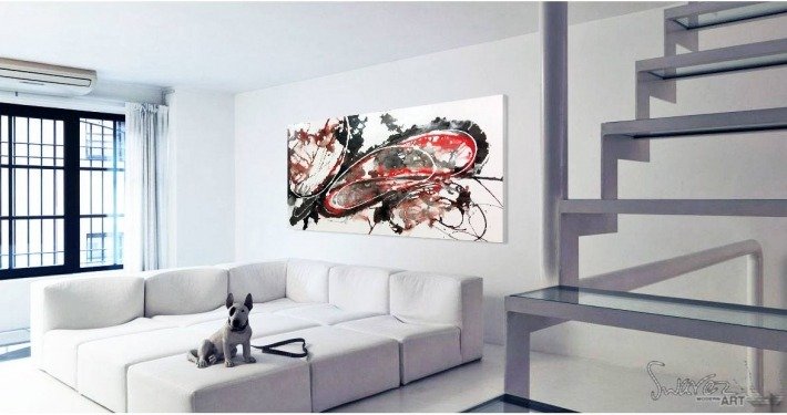
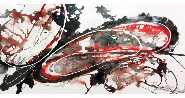
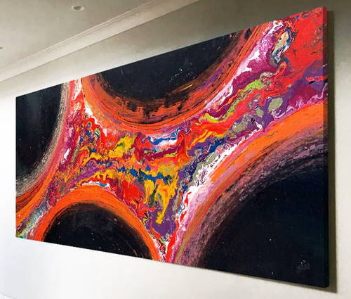
Let me begin by firstly telling you where the name for this medium-sized black and red abstract came from.
Sometimes names come easy to me (I always name my paintings after they are finished). Sometimes, however, they do not. And then there are the odd few that almost cannot be named. That’s not to say I can’t find anything appropriate – it’s that I can’t find anything I like. And that is the problem; the organic squishy thing that attaches meaning to them (me).
So after having had this painting finished for over six months it is only now I have been able to name it – and I have struggled like mad until it hit me; I used the file-name of one of the images (_9). That’s it. It’s probably my equivalent of other artists calling their work ‘Untitled 4‘ or ‘Sketch No.15‘. That kind of apathy annoys me and although the end result is one based on an image name on my computer, naming this painting has not been without a great deal of torment and stress.
OK, thanks for bearing with me on that one; let’s now look at this very unusual (and mildly psychotic) painting.
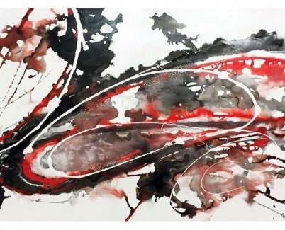
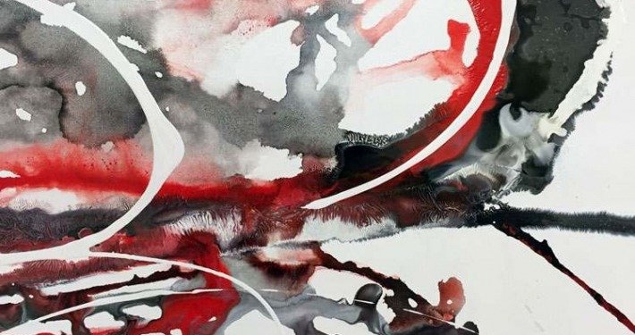
At first glance it can appear haphazard and random; perhaps a little chaotic even. The truth of it, however, is the opposite. The main body of the painting is composed of three layers. The base is a very loose mix which allows the paint to move in a rough organic way, finding its own levels and movements whilst sitting within the shapes I’ve poured it into. I allow an hour or two for this to lose some of it’s thinning medium (and until it has settled) then apply a thicker set of movements within the first wave.
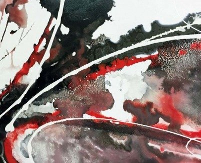
At this point it has a tendency to fall below the very thin layer (applied previously) as the thicker paint is heavier. So the trick to combining both is to make the first layer as thin as I can. Now I have a clearer set of defined shapes blending and morphing into the delineated, organic shapes around them. Pretty neat so far.
However it’s the carefully structured top lines of white that pull the chaos of the underpinning layers together. This is the final application that defines each section of the painting and also the shape separations. Definition is key in most things otherwise your eyes have a hard time working things out. For me it’s the art equivalent of putting full stops in sentences.
One of the great things about combining different thicknesses of paint (and these are extreme may I add) is that even though the colours may be few the shapes and textures are abundant. The subtlety of how these first two layers interweave with each other is almost infinite in its fascination; something to get lost in perhaps?
It is precisely these characteristics that help take a very strong and dominant painting and turn it into one of surprising refinement and pleasure. I said at the top of the page it will be one for the individualists who might have a big white wall somewhere – I still think that’s true, but if you can get your head into the movement, composition and temperance this abstract carries I think you probably live with it anywhere.


