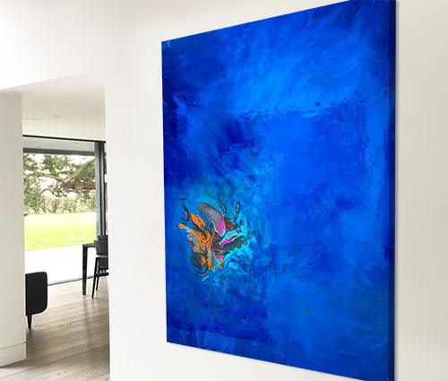
Ticking the right boxes
In my opinion the painting fulfills on a number of levels. Firstly it’s quite earthy and elemental. By this I mean it has a very primordial quality to it; an explosion or the creation of a star in the universe is wondrous and spectacular to say the least. These are the things it reminds me of.
It also has the ability to add a dash of colour to a space where there would otherwise be none, making it perfect for a neutral colour scheme. But it does this without the worry of killing the space or flow of the room it hangs in. Much of that is down to the elements of white and black that ground the intensity of the colours that surround them.
It also ticks the brightness box. Very often I see spaces in need of light and life and this is exactly the kind of painting that can do just that.
Living with it
Having hung it in pride of place at my gallery for a week or so I can say with total confidence that this is one of the easiest paintings to live with that I’ve ever done. It may surprise you to hear that and I am trying not to base that on bias or because I like my own work.
No, that statement is founded upon the abundance of light and dark, the colours being perfectly balanced and not too overpowering and the ability it has to suck you in to a universe full of wonderful things. Not too over the top but just enough ‘wow’ to make you realise you still have a pulse.