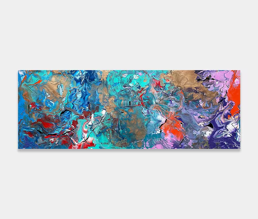
A large original contemporary art work featuring blue and gold
Atlantic Drift is a large contemporary art original and reminds me of driving to Boston at Christmas time, as the snow begins to fall.
As the highway miles rush by like seconds on a watch face I can feel warm air blowing through the car as the radio conjours up my favourite seasonal tunes in an embrace of easy-going familiarity.


")
")
")
")
")
")
An large original contemporary art work with a nautical theme
There’s no denying that this painting is loosely based on things like beaches, waves, lagoons and other coastal and oceanic references. There’s something very compelling about the sea and I am drawn towards it greatly. Atlantic Drift also has other references too, albeit personal ones, of flying to Boston at Christmas time.
Perhaps that’s a little at odds with the whole coastal thing but I have such vivid images in my head that I simply had to paint them. In the end I gave in and decided to paint an abstraction of what my mind sees. The result could be seen as crossing an ocean and watching the snows come as winter descends.
See what you want; but keep the oceans in mind
It’s as much about seasons and traveling as it is being relaxed on a tropical island. And that’s the absolute magic of a painting like this – you can figure out your own story and make it yours. You get to feel that for yourself and it’s a reaction that will be uniquely yours.
I’ve seldom done anything like this before and certainly not as frugal with colour. It was kinda cool though and the result, albeit a very personal one, is also a very accessible one and I’m very excited to be able to share it at last. I could have easily gone mad with all the textures and feelings I can associate with the subject matter but for once I pulled myself together and kept focused on thoughts of the ocean.
Mixing up the techniques
I enjoy painting like this enormously. I guess it’s the mix of styles and techniques that appeals so much; being able to throw, drag, splash and brush on one canvas has produced some very cool results. It’s this ‘coolness’ that forms the underlying trend behind the painting; both in the way it’s structured, the colours I use and also in the interpretation that goes behind it.
Key to the success of the way it’s painted is the use of a few specialized tools. Mainly I refer to a woolen sponge mop that I use to drag into all sorts of shapes. There are also elements of syringed paint, droplets (from a pipette) and even some hand daubs (yes, I still get busy with my hands after all these years).
Metallic copper and gold
I quickly want to mention these two beautiful metallic finishes. For a start who doesn’t like gold? Even if the metal is not to your taste then think of fine golden beaches and you’ll see why the blue fits in so well with it. After all, it’s how mother nature assembles her coastline. Both gold and copper are fused together to create a truly mesmerizing shimmer as light hits it. The downside to this is that it’s almost impossible to capture with a camera. So you’ll have to take my word for it when I tell you how gorgeous it is.
It’s this part of the painting that allows the intensity of the blue colours to really show themselves off. What I’ve tried to do is show these in waves, being built up in repeating layers as they circulate around the gold and copper highlights. You could say it’s like waves coming into shore I guess but I don’t want to get too committed into saying that’s what they actually are!
Perhaps you should just enjoy it for whatever it says to you. Ice cream anyone?