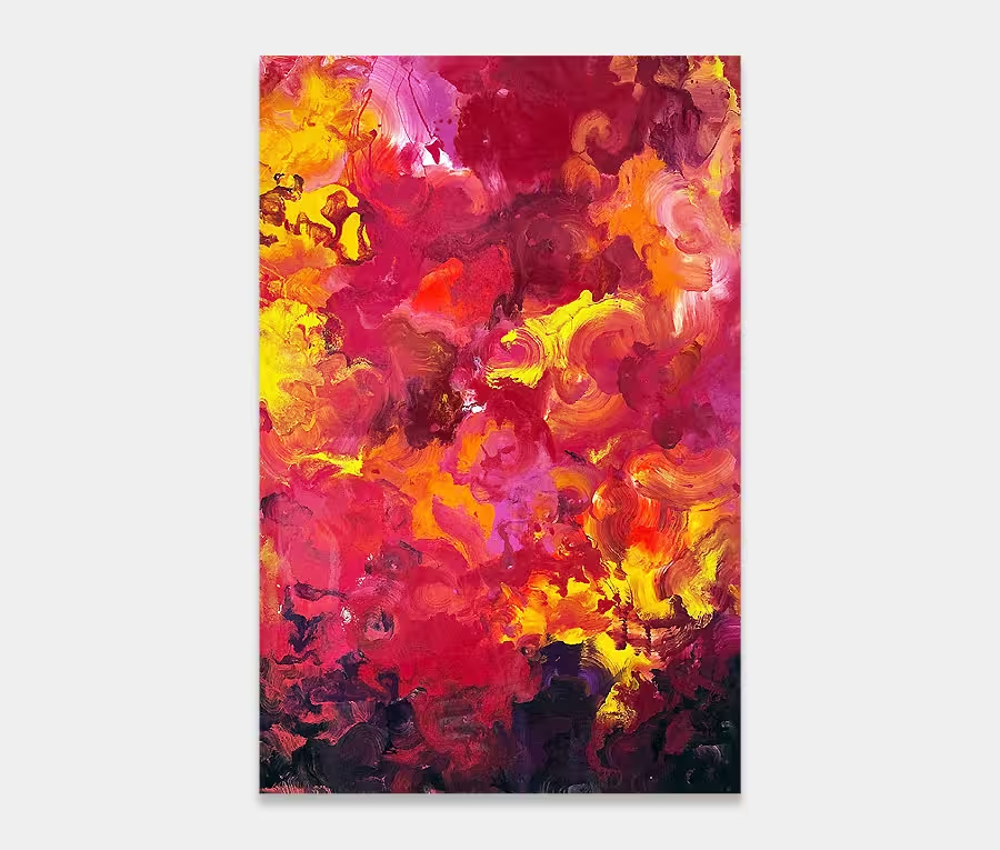
This large sized red and purple art work is, and I use this phrase sparingly, bloody gorgeous.
I’d been playing with the idea of a split red and purple painting for a very long time – in fact it’s not been since 2013 that I’ve painted anything remotely like this. Back then I created one of a similar size but a lot more chaotic, called Red Five. I adored that painting and was loathed to see it leave me. Three years on and, though the principle of splitting these two magnificent colours remains, this new painting is leaps and bounds ahead of where I was back then.
Gone are the exotic splashes and drops and in comes a rare subtlety made out of tiny and infinitely engaging details. And I made the conscious decision not to go overboard with colour to make my point. Instead I’ve weaved in a delicate light mushroom grey into the separation between purple and red and not relied on anything other than my fluid shaping to create the energy and motion I had in Red Five.
It’s this kind of ballsy approach I’m becoming more comfortable with these days. And for that to work it doesn’t mean I have to scream from the rooftops with a crass and poorly thought out collection of canvases; no, in fact it’s quite the opposite. As the fear decreases so the maturity arrives. It allows me to stand behind the decisions I make and extend my abilities to a place I enjoy working from. That will always result in better art. No question about that.
And so it is with Addicted to That Rush (also a killer tune by Mr. Big) that I can express this newly-discovered calmness with a painting that still retains all the elements you’d expect from a Swarez original but has definitely become a lot more considered and created with more respect to my materials. For me it has a particular air of quietness about it – like the calm before the storm. You absolutely know what’s coming but enjoy the intensity of that moment before all the shit kicks off.
So rather than get stuck into the explosive force of the event I choose to present you with the pre-cursor to it. My own view suggests that this intensifies the feelings you may get from it, but I guess this will always be a different experience for us all. I’m just trying to help you get something from it by vocalizing my own interpretations.
Wave after wave of movements rise and fall as the lightness of the grey dances across the centre; the deep purple (mixed with metallic gold) surges upwards fueling the tempestuous cascades above it – peppered with a radiant metallic silver oxide paint (a wonderful light reflector). As energy fades the blanket of red envelopes and reassures. And so the cycles continue.
I like to think there are always more things to look at in my paintings the more you look at them. This is a perfect example. I mean, I haven’t even mentioned the gloss finish to it yet or the way it wraps round the edges of the frame. It just keeps on giving. Marvelous.
")

")
")


")